DESIGN
Organic anti-grid layout design tutorial 2026 is taking the web world by storm right now. Imagine ditching those perfect, rigid columns that make every site look like a spreadsheet and instead crafting something that feels alive, flowing like a gentle river through a forest. That’s exactly what this approach delivers—designs inspired by nature’s imperfect beauty, full of curves, asymmetry, and intentional chaos that still guides the eye effortlessly.
Hey, if you’ve been building websites for a while, you know the drill: bootstrap grids, 12-column systems, everything neatly aligned. But in 2026, users are craving something more human. They’ve seen enough cookie-cutter templates. This organic anti-grid layout design tutorial 2026 will walk you through why this shift matters, how to pull it off without breaking usability, and step-by-step ways to implement it in your projects. Whether you’re a beginner dipping your toes or a seasoned designer looking to refresh your style, let’s dive in.
What Exactly Is Organic Anti-Grid Layout Design?
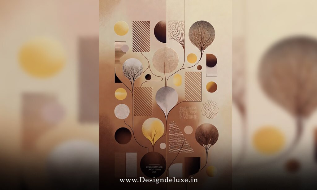
Picture this: traditional grids are like city blocks—straight, predictable, efficient. Organic anti-grid layouts? They’re more like a winding mountain path. Elements float, overlap slightly, curve around each other, and break free from straight lines. The “organic” part draws from biomorphic shapes—think leaves, pebbles, water ripples—while “anti-grid” means deliberately avoiding strict columnar structure.
This isn’t random mess. It’s controlled freedom. In an organic anti-grid layout design tutorial 2026 context, balance comes from visual weight, not symmetry. A big, bold hero image on one side might counterbalance scattered text and icons on the other. The result? Websites that feel personal, creative, and emotionally engaging.
Why does this resonate so much today? After years of ultra-minimalism and AI-generated uniformity, people want warmth. This trend humanizes digital spaces, making brands stand out in a sea of sameness.
Why Organic Anti-Grid Layouts Are Dominating Web Design in 2026
Let’s be real—2026 web trends scream rebellion against rigidity. Rigid grids served us well for responsive design, but they’ve become predictable. Organic anti-grid layouts flip the script by prioritizing movement and storytelling.
First off, they boost engagement. When elements don’t snap to a grid, the eye wanders naturally, creating a narrative flow. Users linger longer because the design feels exploratory, not directive.
Second, accessibility gets a subtle upgrade. With thoughtful spacing and contrast, these layouts can guide focus better than uniform boxes—think larger touch targets in curved areas or clear hierarchy through size and color.
Third, branding wins big. Creative agencies, artists, fashion brands, and lifestyle sites thrive here. It screams “we’re unique” without saying a word.
Of course, it’s not all sunshine. Poor execution leads to confusion or slow load times from complex CSS. But done right? Magic.
For inspiration, check out how some top sites play with this—explore trends on Figma’s design resources or see practical implementations via Elementor’s trend guides.
Key Principles Behind Organic Anti-Grid Layout Design
Mastering an organic anti-grid layout design tutorial 2026 starts with core ideas.
Asymmetrical Balance — Forget mirror images. Use visual weight: dark colors feel heavier than light ones, large elements outweigh small ones. It’s like a seesaw with uneven kids—one big kid close to the center balances a smaller one farther out.
Flow and Movement — Guide the eye with curves and diagonals. Elements lead naturally down the page, mimicking how we read in nature—wandering, not marching.
Negative Space as a Hero — White space isn’t empty; it’s breathing room. Generous margins around organic shapes make everything pop.
Layering and Overlap — Subtle overlaps add depth, like leaves overlapping on a forest floor. Use z-index wisely to keep important content on top.
Organic Shapes Over Rectangles — Swap sharp corners for blobs, waves, and blobs created with SVG or CSS clip-path.
These principles ensure your design feels intentional, not sloppy.
Tools You’ll Need for Your Organic Anti-Grid Layout Design Tutorial 2026 Journey
You don’t need fancy software to start.
- Figma or Adobe XD — Perfect for sketching asymmetrical compositions.
- Webflow — No-code king for fluid, responsive organic layouts.
- CSS Grid + Flexbox — The backbone. Combine with custom shapes.
- Clip-path and Shape Dividers — For those curvy sections.
- GSAP or Framer Motion — Add subtle animations to enhance flow.
Start simple: prototype in Figma, then code it.
Step-by-Step: Building Your First Organic Anti-Grid Layout
Ready to get hands-on? Here’s a beginner-friendly walkthrough for an organic anti-grid layout design tutorial 2026-style homepage section.
Step 1: Plan Your Composition
Sketch on paper first. Decide focal points—a large hero image left-heavy, text drifting right, icons scattered below like fallen petals.
Step 2: Set Up HTML Structure
Keep it semantic.
<section class="hero-organic">
  <div class="hero-bg shape-one"></div>
  <div class="content-wrapper">
    <h1>Your Organic Adventure Starts Here</h1>
    <p>Break free from grids...</p>
  </div>
  <img src="organic-image.jpg" alt="Natural flow" class="hero-image">
</section>
Step 3: CSS Magic for Anti-Grid Feel
Use position relative/absolute for overlap, clip-path for shapes.
.hero-organic {
  position: relative;
  min-height: 100vh;
  overflow: hidden;
  background: linear-gradient(to bottom right, #f0f4f8, #d9e2ec);
}

.shape-one {
  position: absolute;
  top: -10%;
  left: -20%;
  width: 150%;
  height: 120%;
  background: #a8dadc;
  clip-path: ellipse(120% 80% at 30% 60%);
  z-index: 1;
}

.hero-image {
  position: absolute;
  bottom: 10%;
  right: 5%;
  width: 60%;
  border-radius: 60% 40% 70% 30%/50% 60% 40% 50%;
  box-shadow: 0 20px 40px rgba(0,0,0,0.2);
  z-index: 2;
}

.content-wrapper {
  position: relative;
  z-index: 3;
  max-width: 50%;
  padding: 15% 5% 5% 10%;
}
Tweak percentages for asymmetry. Add media queries for responsiveness—stack on mobile.
Step 4: Add Subtle Animations
Float elements gently.
Use keyframes for a parallax-like drift.
Step 5: Test and Refine
Check on devices. Ensure readability—contrast ratios matter. Tools like WAVE help.
Practice this, and you’ll nail the organic anti-grid layout design tutorial 2026 vibe.
Common Mistakes to Avoid in Organic Anti-Grid Layouts
Even pros slip up.
Don’t overdo chaos—always have a clear hierarchy.
Avoid tiny text in flowing areas.
Test load times; heavy SVGs kill performance.
Forget mobile—anti-grid must adapt, not collapse into mess.
Keep it user-first.
Advanced Techniques for Pro-Level Organic Designs in 2026
Level up with CSS Grid areas for hybrid layouts—grid for structure, absolute for organic pops.
Incorporate blob makers for shapes.
Use scroll-triggered animations to reveal elements organically.
Pair with micro-interactions for delight.
Real-World Examples Bringing Organic Anti-Grid to Life
Creative portfolios often lead—off-center navs, curved text blocks. Agency sites use overlapping hero elements for drama.
These inspire without copying.
Conclusion: Embrace the Organic Shift in Your Designs
There you have it—an organic anti-grid layout design tutorial 2026 that covers the why, how, and what next. We’ve explored ditching rigid structures for fluid, nature-inspired flows that make websites feel alive and human. From principles like asymmetrical balance to hands-on CSS tricks, you’re now equipped to experiment confidently.
The beauty? This trend isn’t fleeting—it’s a return to creativity in a templated world. Start small: tweak one section on your next project. Watch engagement rise as users connect emotionally. You’ve got this—go create something beautifully imperfect.
FAQs
What makes organic anti-grid layout design tutorial 2026 different from traditional grids?
Traditional grids rely on even columns for order, while organic anti-grid embraces asymmetry, curves, and natural flow for a more human, engaging experience—perfect for creative sites in 2026.
Is organic anti-grid layout design tutorial 2026 beginner-friendly?
Absolutely! Start with basic CSS like clip-path and positioning. Tools like Webflow make it no-code friendly, building confidence step by step.
How do I ensure responsiveness in an organic anti-grid layout design tutorial 2026 project?
Use media queries to adjust shapes and stacking. Hybrid approaches—grid for mobile, absolute for desktop—keep things fluid across devices.
Can organic anti-grid layouts hurt SEO or accessibility?
Not if done thoughtfully. Maintain semantic HTML, proper contrast, and logical tab order. Search engines care more about content than perfect alignment.
Where can I find more inspiration for organic anti-grid layout design tutorial 2026?
Explore design communities like Dribbble or Awwwards. Study 2026 trend reports for fresh examples of flowing, asymmetrical web designs.