Mobile App Design
Mobile ad creative best practices 2026 boil down to one brutal truth: your ad has about two seconds to stop a thumb on a tiny screen before it gets swiped into oblivion. Get it right and you win attention, clicks, and sales. Get it wrong and you’re burning budget on pretty pictures nobody remembers.
In 2026, mobile dominates everything. Vertical formats rule feeds. Short, sound-off friendly videos outperform everything else. Authenticity beats polish. And the winners treat creative like a system — not one-off pretty assets.
Here’s the no-fluff overview:
- Vertical-first everything: 9:16 rules TikTok, Reels, YouTube Shorts, and Meta feeds. Horizontal video feels awkward and gets ignored.
- Hook hard and fast: First 2-3 seconds must deliver problem, emotion, or curiosity. No slow builds.
- UGC-style wins: Real people, phone-shot footage, and unpolished energy often beat studio perfection for engagement and lower CPAs.
- Thumb-friendly design: Large text, big tappable areas, simple layouts that load instantly even on variable connections.
- Test relentlessly: Pair strong creatives with smart layout experiments to turn views into conversions.
Why Mobile Ad Creative Demands a Complete Overhaul in 2026
Mobile users scroll like their life depends on it. Feeds are endless. Attention spans? Shorter than ever.
In India, many users juggle budget devices and spotty data. In the USA, premium phones meet hyper-competitive feeds where every brand fights for the same eyeballs.
The old rules — big hero images, dense copy, cinematic production — die fast on phones. What works now feels native. It stops the scroll because it looks like it belongs in the feed, not like an ad screaming “buy me.”
Think of your creative as a street performer in a crowded market. You have one beat to grab attention before the crowd moves on. Flashy tricks might get a glance. Genuine energy and a clear promise keep them watching.
Core Mobile Ad Creative Best Practices for 2026
Nail these fundamentals or waste your time.
Format and Technical Specs
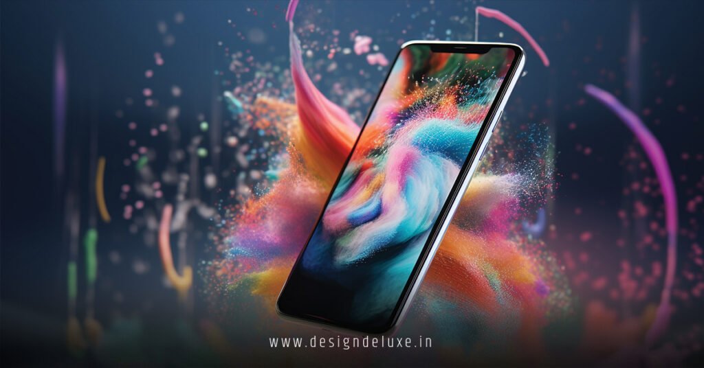
Shoot vertical 9:16 (1080×1920) as your primary. It fills the screen perfectly.
Keep videos short — 15 seconds ideal, max 30 for most performance campaigns.
Use high resolution (1080p preferred) but compress smartly for fast loading.
Add captions and text overlays — most users watch on mute. Bold, readable fonts that pop on small screens.
The Hook Formula That Actually Works
Seconds 1-2: Show the problem or spark curiosity.
Seconds 3-7: Deliver your solution with clear benefit.
Last few seconds: Strong CTA plus proof (result, testimonial, number).
Drop viewers straight into the action. No warm-up intros. Real people using the product on camera beats stock footage every time.
Creative Styles That Convert
- UGC and “phone-shot” authenticity: Lo-fi energy builds trust faster than glossy ads.
- Bold visuals with high contrast: Bright colors, clear focal points, minimal clutter.
- Modular assets: Create hooks, offers, proof points, and CTAs separately so you can mix and match quickly.
- Sound strategy: Design for sound-off first, then layer trending audio or voiceover to boost algorithmic reach.
Platform-Specific Nuances
Meta and Instagram favor native-looking Reels and Stories with shopping tags.
TikTok demands trend-native energy and Spark Ads from real accounts for better performance.
Google App Campaigns or display? Provide multiple orientations (vertical, square, landscape) and fill every asset slot — videos still lead.
Mobile-Specific Design Rules
Large, thumb-zone CTAs (bottom third of screen).
Text big enough to read without zooming.
Fast-loading assets — compress images under 100KB where possible.
Simple backgrounds so the message stands out instantly.
Comparison Table: What Works vs. What Flops in 2026 Mobile Ads
| Element | Winning Approach (2026) | Common Mistake (Still Used) | Why It Matters on Mobile |
|---|---|---|---|
| Video Format | 9:16 vertical, 15-sec max | Horizontal or repurposed long-form | Fills screen; feels native |
| First 3 Seconds | Problem + emotion or strong visual hook | Brand logo + slow intro | Stops scroll or loses user instantly |
| Style | UGC, real people, unpolished | Studio-polished cinematic | Builds trust; higher engagement |
| Text & Captions | Bold, large, overlaid throughout | Small text or none | Sound-off viewing is default |
| CTA Placement | Large button in thumb zone | Small text link at bottom | Easier taps, fewer abandons |
| Production Volume | Modular library + weekly iterations | One perfect ad run for weeks | Combats fatigue; feeds algorithms |
Use this as your quick checklist before launching anything.
Step-by-Step Action Plan to Build Better Mobile Creatives
- Audit what you have
Pull your top 5 performing ads from the last 30 days. Note common traits in hooks, length, and style. - Build a modular library
Shoot or create 10+ hooks, 5 offers, 5 proof elements, and multiple CTAs. Mix them into variations. - Create vertical-first assets
Film natively on phones. Test different angles and real-user scenarios. - Add text layers and captions
Make every video watchable without sound. - Launch small tests
Run 3-5 variations against each other. Keep budgets controlled until clear winners emerge. - Analyze and iterate fast
Kill losers quickly. Scale winners and create new spins on what worked. - Optimize for your markets
In India, prioritize lightweight files and clear value in local contexts. In the USA, lean into premium production that still feels authentic.
Common Mistakes That Kill Mobile Ad Performance
- Overproduced ads that scream “advertisement” — users tune out.
Fix: Test raw, customer-style footage first. - Ignoring the first two seconds — beautiful but slow creatives die fast.
Fix: Start every video in the middle of the story. - Tiny text or cluttered layouts — impossible on small screens.
Fix: Preview on actual phones, not just your design tool. - Running the same creative too long — fatigue kills ROAS.
Fix: Plan for fresh variants every 1-2 weeks. - Forgetting sound-off design — then wondering why completion rates suck.
Fix: Captions and strong visuals first.
Linking Creative Success to Layout Testing
Strong creative gets the click. But the real money happens after.
Once your mobile ad creative stops the scroll, send traffic to pages that match the promise. This is exactly where A/B testing ad layout designs for mobile-first marketing funnels becomes your secret weapon. Test how different post-click layouts handle the traffic your new creatives generate. The combo of thumb-stopping ads plus friction-free funnels is where ROAS explodes.
Key Takeaways for Mobile Ad Creative in 2026
- Vertical 9:16 short videos are non-negotiable for most social and feed placements.
- Hook in the first 2-3 seconds or lose the user forever.
- Authenticity and UGC-style content often outperform high-production ads.
- Design every creative for sound-off viewing with big text and clear visuals.
- Build modular assets so you can iterate fast and fight ad fatigue.
- Test multiple variations relentlessly — creative is now your main targeting lever.
- Always preview on real mobile devices in both India and USA network conditions.
- Combine killer creative with clean funnel layouts for full-path wins.
Mobile ad creative best practices 2026 reward speed, simplicity, and authenticity. The brands winning right now produce more, test faster, and stay obsessed with how real people hold their phones.
Stop guessing. Start building a small library of vertical hooks this week. Run them, measure brutally, and double down on what moves the needle.
Your next campaign doesn’t need to be perfect. It needs to be fast, vertical, and impossible to scroll past.
FAQ
What are the most important mobile ad creative best practices for 2026?
Prioritize vertical (9:16) formats that fill the entire phone screen, hook viewers in the first 1–3 seconds, and use large, thumb-friendly text and CTAs. Keep designs simple with one clear message, add captions for sound-off viewing, and favor authentic UGC-style content over polished studio production. Provide multiple asset variations (portrait, square, landscape) to give platforms like Google and Meta more options to optimize performance automatically.
Why does vertical video dominate mobile ad creative best practices in 2026?
Vertical videos occupy 100% of the mobile screen without black bars or wasted space, creating a more immersive, native feel that boosts watch time and engagement. They align with how people naturally hold their phones. Horizontal or square crops often get letterboxed or cropped poorly, hurting visibility. In 2026, platforms heavily favor true vertical-first creatives for feeds like Reels, Shorts, and in-app placements.
How important is the first few seconds in mobile ad creative best practices?
Extremely important. Most users decide to keep watching or scroll past within 1–3 seconds on mobile. Start in the middle of the story, show the problem or benefit immediately, and use strong visuals or motion to stop the thumb. Weak openings kill even great ideas—test hooks relentlessly because the opening seconds determine whether your ad gets any chance to deliver the message.
Should I use AI-generated creatives for mobile ads in 2026?
AI helps scale production and generate variations quickly, but the best results come from combining AI with human oversight to avoid generic “sameness.” Use AI for rapid ideation, background removal, or asset resizing, then refine for brand voice and authenticity. Pure AI output often underperforms compared to UGC-style or real-people creatives that feel human and relatable on small screens.
How do I test and optimize mobile ad creatives effectively in 2026?
Test one major variable at a time (hook, visual style, CTA placement) while providing a diverse asset library—multiple videos, images, and text options. Run tests for enough traffic to reach statistical significance, review platform asset reports, and refresh winners every 2–4 weeks. Focus on mobile-specific metrics like view-through rate, thumb-stop time, and mobile conversion rate rather than desktop data.