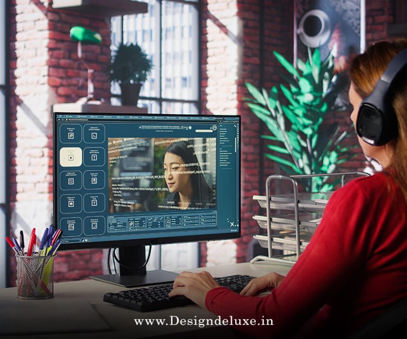
AD Video / Motion Graphics
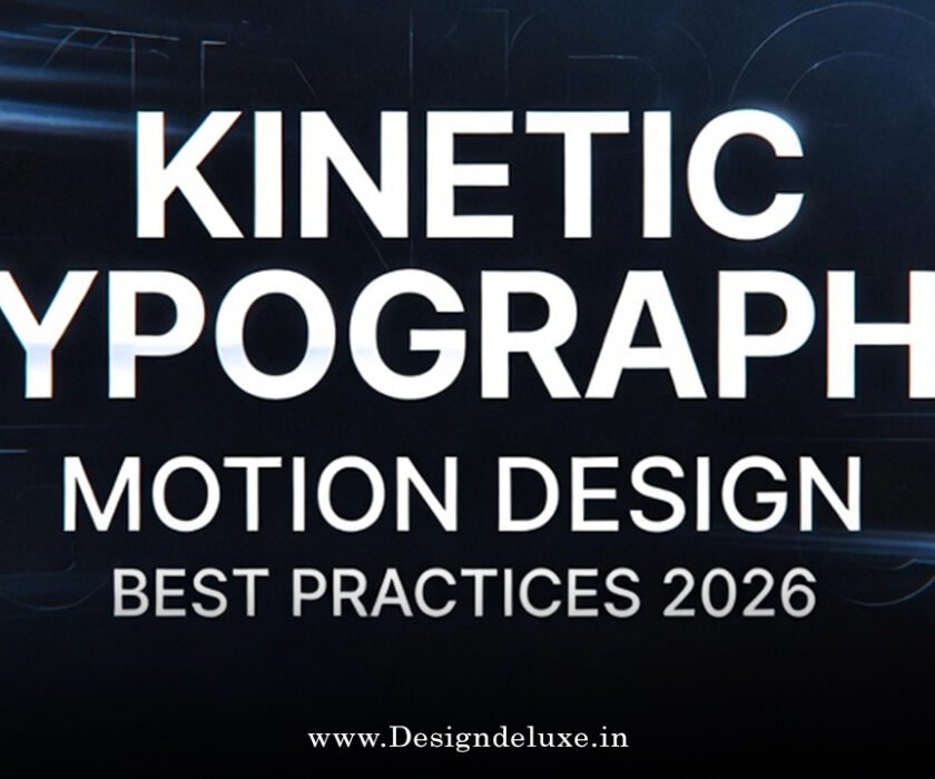
Kinetic typography motion design best practices 2026 are evolving faster than ever, blending cutting-edge tech with timeless design principles to make text not just readable, but unforgettable. Have you ever watched a video where words dance, pulse, or morph in perfect sync with the message? That’s kinetic typography in action—text brought to life through motion. In 2026, as attention spans shrink and screens dominate our world, mastering kinetic typography motion design best practices 2026 isn’t optional; it’s essential for creators who want their work to stand out in social feeds, ads, web experiences, and beyond.
Why does this matter now? Because static text feels flat in a motion-first era. Brands like Spotify have turned kinetic type into storytelling gold, keeping viewers hooked longer. But nailing it requires intention, not just flashy effects. Let’s dive into the kinetic typography motion design best practices 2026 that top designers are using right now to create engaging, accessible, and high-impact work.
What Is Kinetic Typography in Motion Design?
Kinetic typography is the art of animating text to convey emotion, rhythm, and meaning. It’s more than sliding letters across the screen—think words that breathe with the narrative, stretch for emphasis, or explode with energy. In motion design, it pairs typography with principles like timing, easing, and hierarchy to guide the viewer’s eye and amplify the message.
In 2026, this isn’t fringe anymore. It’s mainstream in explainer videos, social reels, brand intros, and interactive web elements. The best part? When done right, it feels natural, almost like the text was always meant to move.
Why Kinetic Typography Motion Design Best Practices 2026 Matter More Than Ever
Short-form content rules the day. Platforms reward videos that grab attention in under three seconds. Kinetic typography does exactly that—drawing eyes to key phrases while syncing with music or voiceover. But overuse leads to chaos, and poor execution kills readability.
Following kinetic typography motion design best practices 2026 ensures your animations feel purposeful. They boost engagement, reinforce branding, and respect accessibility. Designers who ignore these risk creating motion that distracts rather than delights. Ever scrolled past a video because the text was too frantic? Yeah, let’s avoid that.
Core Principles of Kinetic Typography Motion Design Best Practices 2026
Start with the fundamentals. These timeless rules get a 2026 refresh with AI tools, variable fonts, and performance demands.
Timing and Rhythm: The Heartbeat of Motion
Timing is everything. Words should land like beats in a song—too fast, and they’re illegible; too slow, and viewers bail. In kinetic typography motion design best practices 2026, sync animations to audio peaks or scroll speed.
Use easing functions thoughtfully. Elastic or bounce for playful vibes, linear for sleek tech feels. Test on mobile; what looks smooth on desktop can stutter on phones.
Hierarchy and Readability: Don’t Sacrifice Clarity
Motion amplifies hierarchy, but never at readability’s expense. Bold headlines get dramatic reveals, while body text stays subtle or static.
Stick to high-contrast colors and generous spacing. In 2026, trends lean toward minimal motion for clarity—think “simple motion text” over overload. Ask yourself: Can someone skim this in two seconds and get the point?
Purposeful Animation: Move with Meaning
Every animation needs a why. Does it emphasize emotion? Guide attention? Build narrative? If not, cut it.
Kinetic typography motion design best practices 2026 emphasize restraint. Use motion to support the story, not steal it. Subtle breathing effects or scroll-triggered reveals feel modern and intentional.
Top Trends Shaping Kinetic Typography Motion Design Best Practices 2026
2026 brings exciting shifts. Here’s what’s hot and how to apply it.
AI-Assisted Workflows: Your New Creative Partner
AI tools generate base animations, suggest timings, or even create fluid transitions. But pros use them as starting points—human tweaks add soul.
Incorporate AI for rapid prototyping. Refine with manual control for that authentic feel. This hybrid approach speeds up workflows without sacrificing quality.
3D and Variable Fonts: Depth Meets Flexibility
Variable fonts let you animate weight, width, or slant dynamically. Pair with 3D extrusion for immersive effects—text that twists in space or responds to light.
These shine in AR/VR or web experiences. Keep performance in mind; optimize for 60fps across devices.
Emotional and Mood-Driven Motion
Text that “breathes” or pulses with sentiment. Letters expand on excitement, contract on calm. This emotional layering turns typography into a character.
Use it for brand storytelling—energetic brands get bouncy motion, luxury ones get smooth glides.
Fluid Transitions and Morphing
Letters morph seamlessly between words. Liquid-like flows or shape-shifting effects add wow without chaos.
Apply sparingly for impact moments, like key message reveals.
Essential Tools for Kinetic Typography Motion Design Best Practices 2026
Tools evolve quickly. Here’s what’s powering creators today.
Adobe After Effects remains king for complex timelines and plugins like Typoking or Text Force. But alternatives rise—Blender for free 3D integration, Cavalry for procedural animation, or web-focused libraries like GSAP and Motion for interactive sites.
For web kinetic type, React + Three.js handles 3D text beautifully. Test cross-device performance early.
Best Practices for Implementation in 2026
Accessibility First
Motion can trigger issues for vestibular disorders. Offer reduced motion options via media queries. Avoid flashing or rapid changes.
WCAG guidelines matter more than ever—respect user preferences.
Performance Optimization
Heavy animations kill load times. Use efficient codecs, limit layers, and test on real devices. In 2026, mobile-first is non-negotiable.
Testing and Iteration
Show drafts to fresh eyes. Does the motion enhance or distract? Iterate based on feedback.
A/B test versions—subtle vs. bold—to see what resonates.
On-Brand Consistency
Motion is part of identity. Define guidelines: easing curves, animation styles, triggers. This keeps work cohesive across campaigns.
Common Mistakes to Avoid in Kinetic Typography Motion Design Best Practices 2026
Over-animating everything. Too much motion overwhelms.
Ignoring mobile. Desktop previews lie—test on phones.
Skipping purpose. Flashy but meaningless effects feel gimmicky.
Neglecting sound sync. Motion without rhythm falls flat.
Forgetting accessibility. Always include fallbacks.
Advanced Techniques to Level Up
Layer masks for reveal effects. Particle text for explosive energy. Scroll parallax for depth. Sound-reactive animations tie motion to audio peaks.
Combine with micro-interactions—hover pulses or click transforms—for interactive web pieces.
Real-World Examples and Inspiration
Look at Spotify Wrapped: looping, beat-synced type that transforms narratives. Or WIRED’s expressive animations—bold, emotional, and perfectly timed.
Study these to see kinetic typography motion design best practices 2026 in action. They balance flair with function.
Kinetic typography motion design best practices 2026 boil down to intention, restraint, and storytelling. Master timing, prioritize readability, embrace trends like AI and 3D thoughtfully, and always put the audience first. When you do, your text doesn’t just move—it speaks, engages, and sticks.
Ready to bring your words to life? Experiment with these practices today. Start small, iterate often, and watch your motion design transform. The future of text is moving—make sure yours leads the way.
For more on typography evolution, check out Creative Bloq’s typography trends. Explore motion guidelines at Envato Elements. Dive into web animation best practices on Figma’s resource library.
FAQs
What are the key kinetic typography motion design best practices 2026 for beginners?
Start with basics: focus on timing, hierarchy, and purpose. Use simple tools like After Effects for practice, prioritize readability, and test animations on multiple devices. Avoid overcomplicating—subtle motion often wins.
How has AI changed kinetic typography motion design best practices 2026?
AI speeds prototyping and suggests effects, but human refinement ensures emotion and brand fit. Use it as a partner, not a replacement, for authentic results.
What tools are best for kinetic typography motion design best practices 2026?
After Effects leads for pros, with plugins enhancing text work. Free options like Blender suit 3D, while GSAP excels for web. Choose based on your medium—video or interactive.
How do you ensure accessibility in kinetic typography motion design best practices 2026?
Add reduced motion toggles, high contrast, no rapid flashes, and static fallbacks. Follow WCAG to make animations inclusive for all users.
Why is restraint important in kinetic typography motion design best practices 2026?
Restraint prevents overload. Purposeful motion grabs attention without distracting—key in short-attention-span eras. Less truly becomes more.