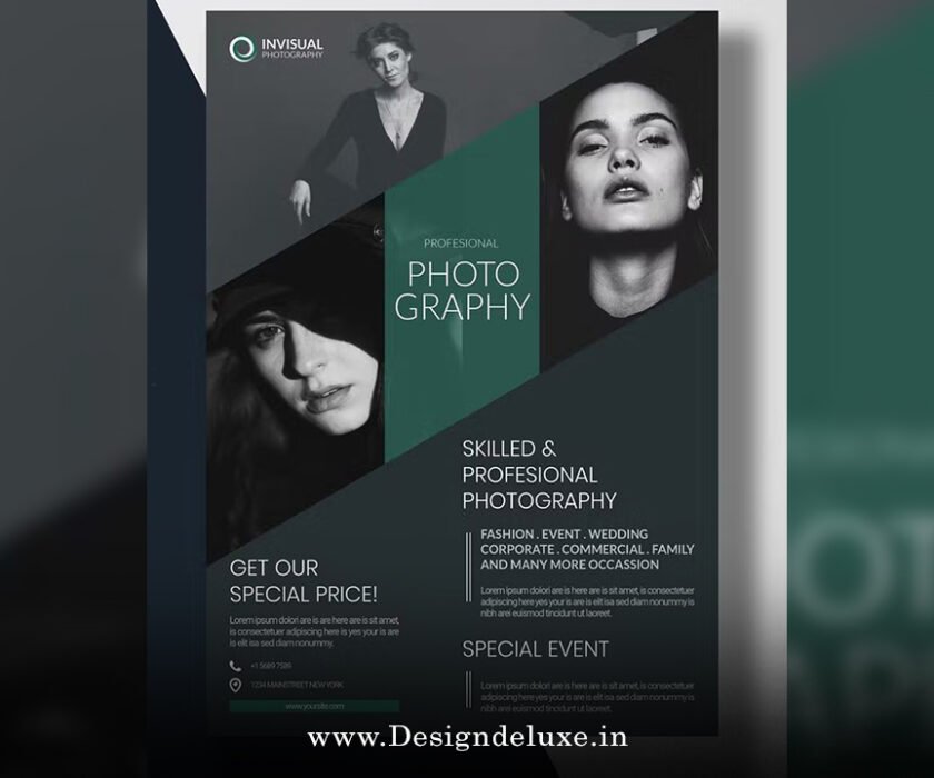
Flyer / Broucher Design
Flyer design ideas with imperfect by design style 2026 are taking the creative world by storm right now. Imagine ditching those ultra-polished, cookie-cutter layouts that scream “AI made me” and instead leaning into something raw, human, and delightfully flawed. That’s exactly what flyer design ideas with imperfect by design style 2026 represent—a bold rebellion against perfection in a year where authenticity wins hearts faster than flawless gradients ever could.
Have you ever picked up a flyer that felt too perfect, almost robotic? It sits there, pretty but forgettable. Now picture one with uneven edges, scribbled notes in the margins, grainy textures like it was photocopied on an old machine, and hand-drawn doodles that look like they were added in a caffeine-fueled burst. That’s the magic of flyer design ideas with imperfect by design style 2026. According to major forecasts like Canva’s 2026 Design Trends, this year is officially the “Year of Imperfect by Design”—a creative shift where designers embrace happy accidents, tactile feels, and personal quirks to stand out in a sea of digital sameness.
What Exactly Is Imperfect by Design Style in 2026?
At its core, flyer design ideas with imperfect by design style 2026 draw from a backlash against over-polished visuals. After years of sleek minimalism and AI-generated precision, creators are craving proof that a real human touched the work. Think of it like wabi-sabi meets punk zine culture: beauty in the imperfect, the transient, the raw.
This style isn’t about being sloppy on purpose. It’s intentional imperfection—controlled chaos that adds warmth and relatability. Elements like subtle noise (that film-grain look), asymmetrical layouts, mismatched fonts that somehow work together, and visible “mistakes” like ink bleeds or torn paper effects make designs feel lived-in and honest. In 2026, with AI tools everywhere, these human touches become the ultimate differentiator.
Why does this matter for flyers? Flyers are quick-hit marketing tools—events, sales, gigs, workshops. In a world where people scroll past perfect ads, an imperfect one stops the thumb. It says, “Hey, this is real. This is made by someone who cares.” That emotional hook? It’s powerful.
Why Flyer Design Ideas with Imperfect by Design Style 2026 Are Exploding Now
Let’s get real: perfection fatigue is real. We’ve been bombarded with flawless Instagram feeds and ultra-clean branding for so long that anything too tidy feels suspicious—like it was churned out by an algorithm without soul. Flyer design ideas with imperfect by design style 2026 flip the script.
Reports from industry leaders highlight a massive surge in searches for DIY-inspired, collage, and raw elements—up as much as 90% in some platforms. People want authenticity, especially post-AI boom. When a flyer looks handmade (even if it’s digitally crafted to look that way), it builds trust. It feels approachable, like a friend handed it to you rather than a corporation blasting it out.
Plus, this style is versatile. It works for indie events, music gigs, art shows, local markets, cafes launching new menus, or even corporate brands wanting to seem more human. The imperfect aesthetic screams creativity without trying too hard—perfect for standing out at a glance.
Key Elements to Nail Flyer Design Ideas with Imperfect by Design Style 2026
Ready to create your own? Here are the building blocks that make flyer design ideas with imperfect by design style 2026 pop.
1. Textures That Feel Tangible
Grain, paper scans, subtle crumples, or Xerox-style copies—these add depth. Layer a faint noise overlay or scan real paper for backgrounds. It tricks the eye into thinking you can touch the flyer.
2. Hand-Drawn and Naive Illustrations
Ditch vector-perfect icons. Go for wobbly lines, uneven fills, childlike doodles. Quirky sketches or stick-figure vibes add personality. Exaggerated proportions? Even better—they feel playful and human.
3. Asymmetrical and Freeform Layouts
Forget strict grids. Overlap elements, tilt text blocks, let things bleed off edges. This “controlled mess” creates energy and guides the eye naturally.
4. Mixed and Expressive Typography
Combine serif with sans, handwritten scripts with bold grotesques. Use variable fonts for subtle distortions or ink-trap styles amplified for character. “Pick-and-mix” type—collaged letters from different sources—gives that ransom-note charm without chaos.
5. Collage and Layered Elements
Cut-out photos, torn paper, overlapping scraps. Hand-cut collage aesthetics scream DIY and tell a story through texture. Add subtle shadows or bends for dimension.
6. Color Palettes with Soul
Earthy tones mixed with pops of unexpected color. Mismatched schemes that clash just enough to feel intentional. Low-contrast organics or high-drama neons paired with muted bases work wonders.
7. Intentional “Flaws”
Ink bleeds, rough edges, slight misalignments, visible crop marks. These aren’t errors—they’re features that prove humanity.
Specific Flyer Design Ideas with Imperfect by Design Style 2026 to Try Right Now
Let’s get practical. Here are actionable concepts you can adapt today.
Music Gig or Concert Flyer
Picture a black-and-white photocopy vibe with grainy band photo overlapped by hand-scribbled date and venue. Bold, wiggly type for the band name, doodled guitars in corners. Add fake coffee stains for that “passed around” feel. It captures underground energy perfectly.
Local Market or Pop-Up Event
Use earthy textures like scanned kraft paper background. Layer polaroid-style cutouts of products with uneven handwritten prices. Asymmetrical layout with title tilted slightly. Feels community-driven and inviting.
Workshop or Class Promotion
Naive illustrations of tools or people learning. Mixed fonts: chunky headline in distorted bold, details in casual script. Add doodled arrows pointing to key info. Imperfect borders frame it like a notebook page.
Cafe or Food Promo
Collage of food photos with torn edges, overlaid on textured menu paper look. Hand-drawn icons for items, slight color mismatches for charm. “Special today” in wobbly chalkboard style.
Art Exhibition or Gallery Opening
Abstract, painterly marks mixed with typed info. Overlapping layers, visible brush strokes digitally simulated. Rough, organic shapes frame artist names—feels like an invite from the creator themselves.
Fitness or Yoga Class Flyer
Organic imperfect shapes, hand-rendered lotus or poses. Textures mimicking wood or stone. Asymmetrical flow with motivational quote in imperfect handwriting.
Each of these leverages flyer design ideas with imperfect by design style 2026 to feel personal and engaging.
Tools and Tips for Creating These Designs
You don’t need fancy software. Canva, Adobe Express, or Figma work great—many have built-in textures and collage tools. For advanced: Photoshop for custom scans, Procreate for hand-drawn elements.
Pro tips:
- Start with a photo or scan of real paper for base.
- Use blend modes for authentic layering.
- Limit to 3-4 fonts max to avoid true mess.
- Test print—imperfect shines in physical form.
- Balance: Enough flaws for character, not confusion.
Common Mistakes to Avoid
Don’t overdo it—too many “flaws” look forced. Imperfection should feel organic, not random. Always prioritize readability; cool aesthetics mean nothing if text is illegible. And remember: this style works best when it aligns with your brand’s voice. A luxury brand forcing grunge? Awkward.
Wrapping It Up: Embrace the Imperfect Revolution
Flyer design ideas with imperfect by design style 2026 aren’t just a trend—they’re a mindset shift toward more human, authentic visuals. In a digital-heavy world, these raw, textured, slightly flawed designs cut through noise by reminding viewers that real people create real things. They build connection, spark curiosity, and make your message memorable.
So grab your tools, add some grain, doodle a bit, and let go of perfection. Your next flyer could be the one that stops someone in their tracks because it feels honest. Go ahead—make it imperfect. That’s where the magic happens in 2026.
For more on emerging trends:
FAQs About Flyer Design Ideas with Imperfect by Design Style 2026
What makes flyer design ideas with imperfect by design style 2026 different from regular trends?
Unlike polished minimalism, flyer design ideas with imperfect by design style 2026 celebrate raw textures, hand-drawn elements, and intentional flaws to convey authenticity and human touch in an AI-dominated era.
Can beginners create effective flyer design ideas with imperfect by design style 2026?
Absolutely! Start with free tools like Canva, add grain filters, mix fonts playfully, and layer simple collages. The style forgives “mistakes” and rewards experimentation.
Is imperfect by design suitable for all types of events in flyer design ideas with imperfect by design style 2026?
Yes, but tailor it—underground gigs or indie markets love heavy rawness, while corporate events might use subtler textures for a modern edge.
How do you balance imperfection so flyer design ideas with imperfect by design style 2026 don’t look messy?
Focus on intention: Use flaws to guide the eye or highlight key info. Keep hierarchy clear with contrast, and test readability from a distance.
Where can I find inspiration for flyer design ideas with imperfect by design style 2026?
Check platforms like Behance, Pinterest (search “imperfect design 2026”), or Canva’s trend reports. Real-world zines and punk posters are goldmines too.