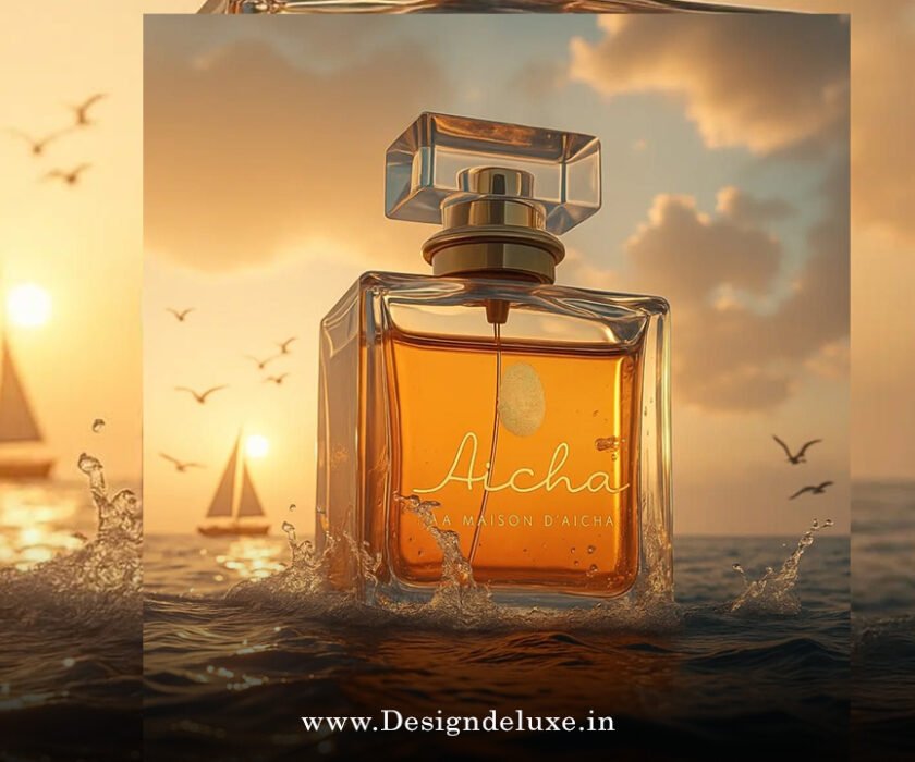
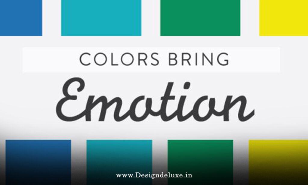
Color Palette
Emotional colour palettes branding 2026 is reshaping how companies connect with audiences on a deeper, more human level. Imagine walking into a store or scrolling through your feed and instantly feeling calm, excited, or inspired—without a single word being spoken. That’s the power we’re talking about here. In 2026, brands aren’t just picking pretty colors; they’re crafting entire emotional experiences through carefully curated palettes that speak directly to our moods, values, and even our collective exhaustion from years of overstimulation.
Why Emotional Colour Palettes Branding 2026 Matters More Than Ever
Let’s be real: we’ve all been bombarded with visuals. Social media, ads, notifications—it’s nonstop. By 2026, people crave genuine emotional resonance. Brands that ignore this risk blending into the background noise. Emotional colour palettes branding 2026 flips the script by prioritizing how colors make us feel over just how they look.
Think about it like this: color is the silent salesperson in your branding. It triggers subconscious responses rooted in psychology. Blue might whisper trust and serenity, while a burst of warm terracotta shouts energy and authenticity. When done right, these palettes build loyalty faster than any slogan ever could.
In a world still recovering from digital overload, emotional colour palettes branding 2026 draws from a mix of calming neutrals and bold accents. Pantone’s choice of Cloud Dancer—a soft, lofty white—for their 2026 Color of the Year perfectly captures this shift toward quiet reflection and respite. It’s not about being flashy; it’s about offering emotional breathing room.
The Psychology Behind Colours: Emotions They Evoke in Branding
Colors aren’t random. They hit our brains in specific ways, influencing everything from mood to decision-making. Here’s the breakdown that savvy brands are using in emotional colour palettes branding 2026.
Warm tones like reds, oranges, and earthy persimmons spark excitement, passion, and urgency. They’re perfect for brands wanting to energize—think fitness apps or food delivery services that make your mouth water just by glancing at the logo.
Cool hues, on the other hand, do the opposite. Blues and greens promote calm, trust, and clarity. In 2026, with mental health front and center, many wellness and tech brands lean into Cool Blue or jade-like shades to signal reliability without overwhelming.
Then there are the neutrals—those soft, grounding tones that act as emotional anchors. Think khaki-inspired beiges or subtle charcoals. They evoke stability and approachability, helping brands feel more human in an AI-saturated landscape.
Ever wonder why luxury brands often stick to muted palettes? Because subtlety builds intrigue and sophistication. In emotional colour palettes branding 2026, this restraint lets bolder accent colors pop, creating contrast that guides the eye—and the heart.
Top Emotional Colour Trends Defining Branding in 2026
So, what palettes are actually winning hearts (and wallets) this year? Let’s dive into the ones dominating emotional colour palettes branding 2026.
First up: Grounded Earth Tones with a Twist. We’re seeing neo-earth palettes—warm umbers, terracottas, and soft olives—paired with unexpected pops like lime Wasabi or electric greens. These evoke a craving for reality and nature amid digital chaos. Brands in sustainable fashion or eco-products love this combo because it screams authenticity.
Next, Calm Minimalist Neutrals. Pantone’s Cloud Dancer leads here, often mixed with pale blues or silvers. It’s all about emotional reset. Wellness brands, spas, and even fintech companies use these to promise peace in a hectic world. Picture a clean white base with subtle Cool Blue accents—trustworthy, modern, and soothing.
Don’t sleep on Bold Yet Balanced Vibrants. After muted years, 2026 brings joyful bursts: Persimmon oranges, Plum Noir deep purples, and vibrant limes. These dopamine-triggering shades add optimism without chaos. They’re ideal for lifestyle or creative brands wanting to stand out emotionally.
And let’s not forget Transformative Teals and jade greens. Blending blue’s calm with green’s growth, they symbolize renewal and resilience—perfect for brands addressing climate awareness or personal transformation.
These trends aren’t isolated; they’re blending. A brand might use Cloud Dancer as a base for serenity, then layer in Plum Noir for depth and mystery. The result? Palettes that feel layered, just like human emotions.
How to Build Your Own Emotional Colour Palettes Branding 2026 Strategy
Ready to create one for your brand? Start with your core emotion. What feeling do you want customers to associate with you? Calm? Excitement? Trust? Nostalgia?
Step one: Research your audience. Gen Z leans toward grounded, nature-inspired tones for authenticity. Millennials might crave those nostalgic retro-futurist mixes.
Step two: Choose a primary color that aligns with your values. For trust-heavy industries like finance, lean into blues. For creative agencies, experiment with bold plums or persimmons.
Step three: Build layers. Use a 60-30-10 rule—60% dominant (often neutral for balance), 30% secondary (emotional punch), 10% accent (call-to-action energy).
Test relentlessly. A/B test logos, websites, and ads. Tools like heatmaps show where eyes linger, revealing emotional impact.
And remember accessibility—high contrast ensures everyone feels included.
Real-World Examples of Emotional Colour Palettes Branding 2026 in Action
Look at wellness brands embracing soft pastels and Cloud Dancer whites—they’re creating sanctuaries online. One major app switched to jade and cool blue palettes last year; user retention jumped because it felt less aggressive.
Fashion houses are mixing Plum Noir with persimmon accents for moody, confident vibes—evoking empowerment.
Even big tech is shifting. Some platforms ditch stark whites for warmer neutrals, making interfaces feel more inviting and less cold.
These aren’t accidents. They’re deliberate emotional design choices paying off in engagement and loyalty.
Challenges and Tips for Mastering Emotional Colour Palettes Branding 2026
It’s not all smooth sailing. Overdoing bold colors can feel chaotic; too much neutral risks blandness. The key? Balance.
Cultural sensitivity matters too—colors mean different things globally. Red signals luck in some places, danger in others.
Stay updated. Trends evolve fast—follow sources like Pantone for official forecasts, Pinterest Predicts for user-driven insights, and WGSN for forward-thinking reports.
Experiment boldly but authentically. Your palette should feel like an extension of your brand’s personality, not a trend chase.
Conclusion: Embrace Emotional Colour Palettes Branding 2026 to Connect Deeper
Emotional colour palettes branding 2026 isn’t a passing fad—it’s the future of meaningful connections. By blending calming neutrals like Cloud Dancer with vibrant accents like persimmon, cool blue, and plum noir, brands create experiences that resonate emotionally. Whether you’re building trust, sparking joy, or offering calm, the right palette turns viewers into loyal fans.
Don’t wait. Audit your current colors today. Ask: Do they make people feel something? If not, 2026 is the perfect time to evolve. Your audience is craving real emotional bonds—give them the palette that delivers.
Ready to transform how your brand feels? Dive in and watch the connections deepen.
FAQs
What exactly is emotional colour palettes branding 2026?
Emotional colour palettes branding 2026 refers to using color combinations that deliberately evoke specific feelings—like calm, excitement, or trust—to strengthen brand connections in 2026’s design landscape.
Which colors are trending in emotional colour palettes branding 2026?
Key shades include Cloud Dancer white for calm, Cool Blue and jade for trust, Persimmon and Wasabi for energy, and Plum Noir for depth—often mixed for balanced emotional impact.
How does Pantone’s 2026 Color of the Year influence emotional colour palettes branding 2026?
Pantone’s Cloud Dancer, a soft white, promotes quiet reflection and respite, inspiring many brands to prioritize serene, neutral bases in their emotional colour palettes branding 2026 strategies.
Can small businesses use emotional colour palettes branding 2026 effectively?
Absolutely! Start simple—pick one core emotion, choose 3-5 colors, and apply consistently across your logo, site, and socials for authentic emotional resonance without big budgets.
Why focus on emotions in branding colours for 2026?
In a noisy digital world, emotional colour palettes branding 2026 helps brands stand out by forging genuine feelings, boosting loyalty, engagement, and conversions through subconscious psychological triggers.