A/B TestingDESIGNMARKETINGMobile App Design
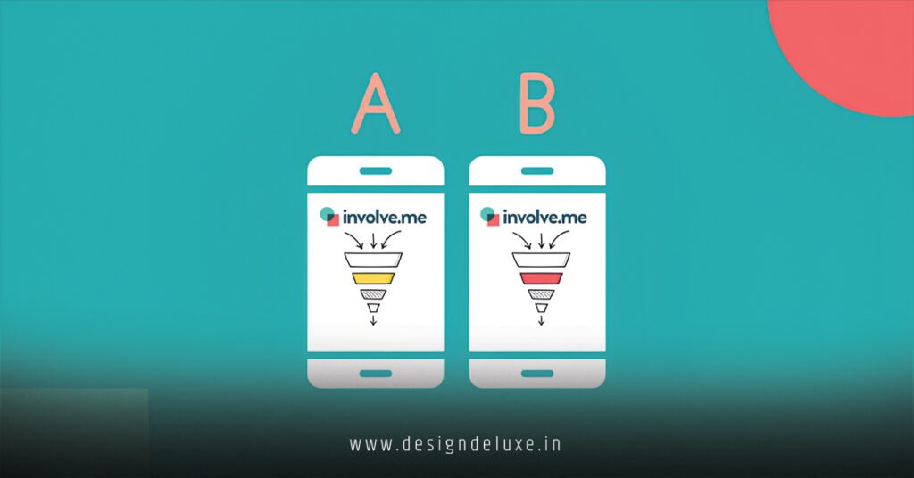
A /B testing ad layout designs for mobile-first marketing funnels isn’t some fancy experiment you run when bored. It’s the sharpest way to stop guessing why your ads flop on phones and start knowing exactly what makes people tap, scroll, and buy.
Here’s the deal in plain terms:
- A/B testing ad layout designs for mobile-first marketing funnels means pitting two (or more) versions of your ad creative and funnel pages against each other—same audience, same budget, different layouts—to see which drives better results on mobile devices.
- It matters because over 60% of digital traffic (often much higher in India and the USA) comes from phones, where tiny screens, thumb navigation, and split-second attention spans rule.
- The payoff? Higher click-through rates, lower bounce, and cheaper conversions when your ad layout matches how people actually use their devices.
- You test elements like vertical stacking, thumb-friendly CTAs, fast-loading hero images, or simplified forms that guide users straight down the funnel without friction.
Quick overview bullets (steal these for your notes):
- What it is: Controlled split tests comparing ad visuals, text placement, button sizes, and funnel flow optimized for mobile screens.
- Why do it: Mobile users swipe fast and abandon slow or cluttered experiences—testing reveals what stops the scroll.
- Key benefit: Data-backed wins that compound across campaigns in competitive markets like India’s growing digital economy or the USA’s mature ad platforms.
- Who needs it: Beginners scaling first campaigns and intermediates tired of flat ROAS.
- Expected outcome: Often 10-30% lifts in key metrics when you isolate one variable at a time.
Why Mobile-First Changes Everything in 2026
Think of your marketing funnel like a crowded Mumbai local train or a hectic New York subway at rush hour. Everyone’s crammed in, moving fast, and only the smoothest ride gets them to their stop. Clunky ad layouts? People bail at the first jerk.
Mobile screens demand ruthless simplicity. Vertical video hooks that stop thumbs in under 3 seconds. Large, tappable buttons placed where fingers naturally rest. Minimal text that loads instantly even on slower 4G/5G connections common in parts of India.
In the USA, where premium devices dominate but attention is sliced thinner by endless feeds, the same rules apply—yet expectations for polish run higher. Test layouts that respect both contexts without building separate worlds.
Here’s the kicker: A layout that crushes on desktop often dies on mobile. Hero carousels? Users swipe past them like banner blindness on steroids. Dense paragraphs? Forgotten before the scroll even starts.
Core Elements to Test in Ad Layouts for Mobile Funnels
Focus on high-impact areas first. Don’t boil the ocean.
Ad creative layouts:
- Single bold image vs. short vertical video
- Text overlay position (top, bottom, or integrated)
- Color contrast and thumb-zone placement for CTAs
- Aspect ratio—9:16 vertical rules mobile feeds
Funnel page layouts (the landing experience after the click):
- Above-the-fold CTA visibility
- Form field count and stacking order
- Trust signals placement (reviews, badges)
- Navigation simplicity—no hidden menus that frustrate thumbs
Flow through the funnel:
- One-step checkout vs. multi-step with progress indicators
- Personalized offers shown early vs. later
Test one variable at a time. Change the button color or size? Keep everything else identical. That’s how you learn what actually moves the needle.
Step-by-Step Action Plan for Beginners
Ready to run your first test? Follow this exact sequence. No fluff.
- Define your goal and hypothesis
Bad: “Make it better.”
Good: “Moving the CTA button higher on mobile will increase conversions by reducing scroll friction.” - Choose your platform tools
Use built-in features—Google Ads Experiments or Meta’s A/B testing in Ads Manager—for clean splits. Segment by device to isolate mobile performance. - Build variants
Create Version A (control—your current layout).
Version B—change only the target element (e.g., larger CTA, simpler headline stack).
Keep audience, budget, and bidding identical. - Set traffic split and duration
50/50 split works for most.
Run at least 7 days or until you hit statistical significance (aim for 100+ conversions per variant where possible). Account for day-of-week effects. - Launch and monitor
Check for anomalies early but resist the urge to tweak mid-test. - Analyze results
Look beyond CTR. Prioritize conversions, cost per acquisition, and ROAS. Segment by India vs. USA traffic if your audience spans both. - Implement winner and iterate
Roll out the winner. Document learnings. Test the next element.
Pro tip from the trenches: In my experience, mobile tests often reveal that simpler wins. A clean vertical layout with one clear offer frequently beats flashy designs.
Comparison Table: Common Ad Layout Variants for Mobile
| Layout Element | Variant A (Control) | Variant B (Test) | Typical Mobile Impact (Experience-Based) | When to Prefer |
|---|---|---|---|---|
| CTA Button Placement | Below product description | Above the fold, large and contrasting | Higher taps, fewer abandons | High-urgency offers |
| Content Density | Multiple images + long text | Single hero + short bullet points | Faster load, better engagement | Slower connections (e.g., parts of India) |
| Video vs. Static | Static product image | 15-sec vertical video with captions | Stronger thumb-stop, higher CTR | Storytelling products |
| Form Steps | Multi-step with many fields | Single screen with 3 fields max | Reduced drop-off | Lead gen funnels |
| Trust Signals | At bottom of page | Next to CTA early | Builds confidence quicker | High-price items |
This table gives you instant ideas. Start with the row that matches your biggest current leak.
Common Mistakes (and Quick Fixes)
Everyone screws these up at first. Here’s what I see repeatedly:
- Testing too many changes at once
Fix: Isolate one variable. You’ll know exactly what worked instead of guessing. - Ignoring statistical significance
Fix: Use platform calculators or simple rules—wait for enough data. Early “winners” often flip. - Forgetting mobile-specific behavior
Fix: Always preview on actual phones. What looks great in your desktop designer can feel tiny or unreachable on a real device. - Running tests during holidays or big sales
Fix: Pick normal periods. Seasonal spikes distort results. - Not segmenting by region
Fix: In India, test for data-light experiences and local language cues. In the USA, lean into faster loads and premium visuals. One size never fits both perfectly. - Stopping too soon
Fix: Give tests time to breathe across weekdays and weekends.
The fix is usually simple discipline. Document your hypothesis every single time.
Real-World Considerations for India and USA Markets
India’s mobile explosion means many users are on budget Androids with variable connections. Prioritize lightweight assets and clear value propositions in Hindi or regional languages where relevant. Fast-loading layouts win big here.
In the USA, competition is fiercer and users expect seamless experiences. Test premium creative—high-res verticals, subtle animations that don’t kill battery. Privacy signals and trust elements carry extra weight.
Cross-market campaigns? Run geo-segmented tests. What resonates in Gadhinglaj might differ from California. Data will tell you faster than assumptions.
Key Takeaways
- A/B testing ad layout designs for mobile-first marketing funnels turns guesswork into repeatable wins by focusing on how real users interact on phones.
- Always test one element at a time for clear, actionable insights.
- Mobile demands vertical formats, large tappable areas, and minimal friction in the funnel flow.
- Prioritize business metrics like conversions and ROAS over vanity clicks.
- Run tests long enough and with enough traffic to trust the results.
- Document everything—your future self will thank you when scaling.
- Simpler layouts often outperform complex ones on small screens.
- Combine creative tests with landing page tweaks for full-funnel gains.
Conclusion
A/B testing ad layout designs for mobile-first marketing funnels is your unfair advantage in a world where attention vanishes in seconds. Get the layout right and your ads don’t just compete—they convert.
Start small. Pick one ad, one layout tweak, one clear hypothesis. Run the test this week. The data will surprise you, and the lifts will compound.
FAQ :
Why is mobile-first design critical when A/B testing ad layout designs for marketing funnels?
Most users now interact with ads and funnels on smartphones, where screen space is limited and attention spans are short. Mobile layouts that prioritize thumb-friendly CTAs, fast-loading visuals, and vertical scrolling often outperform desktop-first designs. Testing different ad layouts (like single-column vs. stacked elements) on mobile can reveal big lifts in click-through and conversion rates because what works on a big screen frequently flops on a phone.
What elements of ad layout should I prioritize in A/B testing for mobile-first funnels?
Focus on high-impact variables first: hero image or video placement, headline positioning, CTA button size/color/location, text hierarchy, and whitespace. Test one change at a time—such as moving the CTA above the fold versus below—to isolate what drives engagement. On mobile, even small tweaks like larger tap targets or simplified layouts can boost performance significantly in the top and middle of the funnel.
How long should I run an A/B test on mobile ad layouts before drawing conclusions?
Run tests until you reach statistical significance, typically with enough traffic for reliable results (often 1-4 weeks depending on volume). Aim for at least a few hundred conversions per variation. Shorter tests risk noise from daily fluctuations, while overly long ones delay decisions. Tools that calculate significance help, but always factor in your funnel stage—top-of-funnel ads may need more traffic than bottom-funnel ones.
Can A/B testing ad layouts improve conversion rates in mobile marketing funnels?
Absolutely. Real-world tests often show 10-30%+ lifts by optimizing layouts for mobile behavior, such as reducing friction in scrolling or making forms thumb-friendly. The key is tying tests to clear metrics like click-through rate, time on page, or add-to-cart actions. Winners in early funnel stages (ad to landing page) compound gains further down the funnel.
What common mistake do beginners make when A/B testing ad layout designs on mobile?
Testing too many variables at once or ignoring device-specific data. Changing headline, image, and button simultaneously makes it impossible to know what actually worked. Another pitfall is not segmenting results by mobile device type or orientation. Fix: Start simple with one layout element, use mobile-only traffic splits, and review heatmaps or session recordings to understand user behavior.