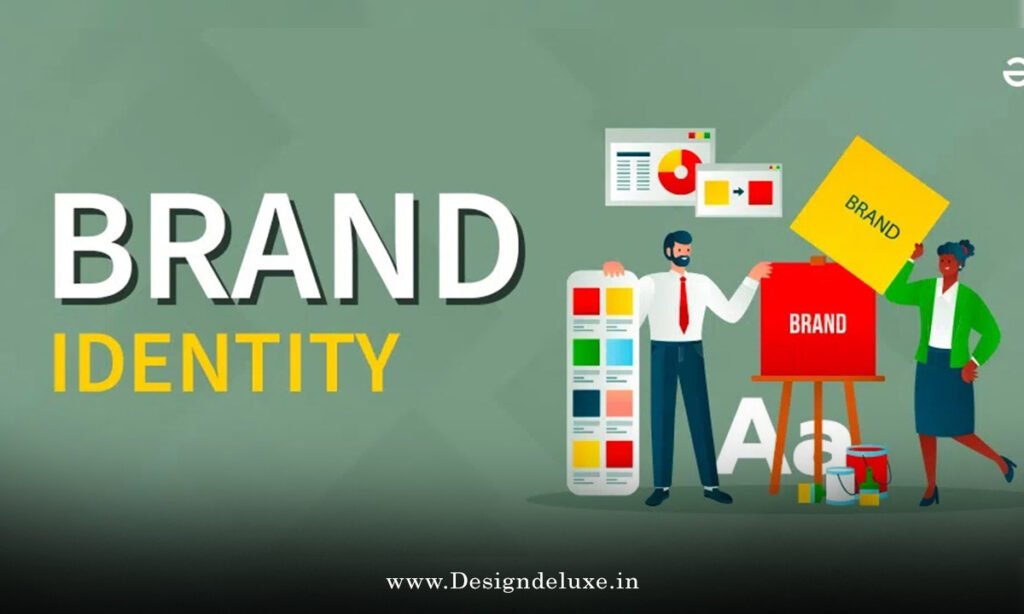
DESIGN
SaaS brand identity design principles form the backbone of how your product communicates with users before they even click the signup button. Get it right, and your brand becomes a competitive advantage. Get it wrong, and you’re invisible in a crowded marketplace.
Here’s what most SaaS founders miss: brand identity isn’t a logo. It’s not a color palette. It’s not even a vibe. Brand identity is a system. A coherent, intentional system that every touchpoint reinforces. Your logo, typography, color choices, imagery style, tone of voice—they all need to sing the same song.
I’ve watched SaaS companies spend months perfecting their product only to launch with a disjointed brand identity. Users get confused. Conversion rates suffer. They end up rebranding within 18 months. Expensive mistake.
Let’s fix that before it happens to you.
What You Need to Know Right Now
SaaS brand identity design principles matter because they directly impact how users perceive your product’s quality, trustworthiness, and fit for their needs. Here’s the practical reality:
- First impressions are near-permanent. Users form brand opinions in milliseconds. Inconsistent visual language signals unprofessionalism or instability, even if your product is solid.
- Brand consistency increases perceived value. Studies show users willing to pay 10–20% premiums for brands perceived as cohesive and intentional versus fragmented competitors.
- SaaS users are skeptical by default. They’re evaluating dozens of tools. Your brand identity either builds trust or creates friction.
- Retention hinges on brand experience. Users don’t just use your product; they experience your brand across email, support, documentation, and social media. Consistency compounds loyalty.
- Hiring and team culture benefit too. A clear brand identity attracts aligned talent and creates internal clarity around company values.
The trap? Overthinking it. SaaS brand identity doesn’t require complexity. It requires intentionality.
Why SaaS Needs Different Branding Than Traditional Business
Here’s the thing: SaaS branding plays by different rules than B2B services or consumer brands.
Your users are decision-makers evaluating you alongside competitors they found through Google or ProductHunt. They’re reading your pricing page. They’re checking your Twitter. They’re scanning your documentation. They’re messaging your support team. Your brand identity needs to work across all these contexts—many of which exist outside your control.
Traditional B2B branding leans on relationships, sales teams, and long trust-building. SaaS branding is closer to consumer branding in speed and reach, but with enterprise-level expectations for professionalism. You need to be approachable and credible. Innovative and stable. Human and professional.
That’s a tighter rope to walk.
Plus, SaaS users expect transparency. A startup vibe can be refreshing, but only if it’s genuine. If your brand signals “we’re a scrappy startup” but you’re charging $500/month, users smell the disconnect. Your brand identity needs to reflect the actual value and maturity level of your product.
The Core Components of SaaS Brand Identity Design Principles
Let’s break down what actually constitutes a SaaS brand identity. This isn’t abstract theory—it’s the toolkit you’ll use to build consistency.
1. Visual Language (Logo, Color, Typography)
Your visual identity is what users see first. It needs to work across devices, backgrounds, and contexts. This includes:
Logo design. Sounds obvious, but here’s where many SaaS companies stumble: your logo needs to function as both a standalone mark and as part of larger compositions. It needs to read at favicon size (16x16px) and at billboard scale. It needs to feel right on your website, in Slack workspaces, and on Twitter. Some SaaS companies are exploring neumorphic logo design trends for modern SaaS applications to signal sophistication through subtle depth, but others lean into minimalism or geometric abstraction. The choice depends on your positioning.
Color palette. SaaS brands typically use 1–3 primary colors and 2–4 secondary colors. Primary colors define your brand personality; secondary colors provide flexibility and breathing room. The trick? Choose colors that work across light and dark backgrounds, print and digital, and various accessibility standards (colorblind-friendly, high contrast for readability).
Typography. Choose 1–2 fonts maximum. One for headlines (can be more personality-driven), one for body text (must prioritize readability). SaaS users spend hours reading documentation and UI labels. Bad typography creates cognitive friction. Web-safe fonts or quality Google Fonts work fine; expensive custom fonts aren’t required.
2. Tone and Voice
How does your brand talk?
This matters as much as how it looks. Are you formal or casual? Jargon-heavy or accessible? Funny or serious? Confident or humble?
Most SaaS brands default to “professional but approachable.” That’s safe but often forgettable. The strongest SaaS brands have distinct voices: Slack’s irreverent humor, Stripe’s technical precision, Notion’s aspirational simplicity, Mailchimp’s playful warmth.
Your voice should reflect your product’s purpose and your users’ expectations. A compliance SaaS won’t get away with memes. An internal tool for designers can be looser.
Consistency in voice matters across website copy, error messages, support responses, email campaigns, and social media. That’s where most SaaS brands fail—they nail the website tone but then sound like different companies in their help documentation.
3. Imagery and Iconography
How do you visualize concepts in your product?
This includes:
- Product screenshots and UI previews. Do you show full interface or magnified features? Do you use annotations or let the UI speak for itself?
- Icons. Are they line-based or solid? Colorful or monochromatic? Playful or technical?
- Photography or illustration. Do you use photos of humans, abstract illustrations, data visualizations, or a combination?
- Backgrounds and patterns. Do you use solid colors, gradients, geometric patterns, or photographic backgrounds?
Consistency here prevents your brand from feeling like five different companies working in one product.
4. Brand Personality and Positioning
This is the strategic layer beneath the visual design.
Who is your SaaS for? What problem do you solve? What values define your company? Your brand personality should embody these answers. A brand positioned as “the professional solution” looks and sounds different from a brand positioned as “the beginner-friendly alternative.”
Your personality should influence every design decision downstream. If you’re building a product for enterprise security teams, your visual identity should communicate rigor and precision. If you’re building for freelancers, warmth and accessibility matter more.
SaaS Brand Identity Design Principles in Practice: Industry Breakdown
Application varies by vertical:
B2B SaaS (Enterprise Focus): Visual identity is typically minimal and serious. Think Asana, Slack pre-redesign, Salesforce. Colors are often neutral (grays, navy) with a single accent color. Typography is clean and readable. The message: “We’re professional. We won’t let you down.” Personality is approachable but not jokey.
B2B SaaS (SMB/Mid-Market Focus): More personality emerges here. Figma, Notion, and Airtable use playful colors and approachable voice while maintaining professionalism. The balance is tighter—you need to appeal to both C-suite executives and individual contributors.
Consumer SaaS (B2C): Maximum personality. Duolingo’s owl, Calm’s soothing aesthetic, Discord’s gaming culture—these brands wear their identity loudly. Visual language is often playful, color palettes are bolder, and voice is conversational.
Niche/Vertical SaaS: Depends on the niche, but there’s usually room for personality within the guardrails of professionalism. A legal tech SaaS can be friendlier than traditional law firms while still respecting their users’ professional context.
| SaaS Category | Visual Complexity | Color Strategy | Tone | Risk Level |
|---|---|---|---|---|
| Enterprise | Minimal | Neutral + 1 accent | Formal, precise | Low |
| Mid-Market | Moderate | 2–3 colors, purposeful | Friendly, professional | Medium |
| SMB | Moderate to high | Bold, expressive | Conversational, supportive | Medium-high |
| Consumer | High | Full palette, playful | Casual, personality-driven | High |
| Vertical/Niche | Moderate | Industry-specific context | Personalized to audience | Medium |
The Five Principles of Strong SaaS Brand Identity
These aren’t rules. They’re guardrails.
Principle 1: Consistency Across Touchpoints
Every interaction a user has with your brand should feel like it’s coming from the same company. This means:
- Your website looks like your product looks like your email campaigns.
- Your tone in blog posts matches your tone in support responses.
- Your social media personality aligns with your product onboarding experience.
Inconsistency signals either incompetence or indifference. Users pick up on this, even subconsciously.
Implementation: Create a brand guidelines document. Yes, really. Even if it’s just 3–5 pages. Document your color codes (hex values, RGB, CMYK), typography choices, logo usage rules, tone of voice guidelines, and imagery style. Share it with anyone creating content in your brand’s name.
Principle 2: Differentiation Within Category
You’re competing against dozens of similar solutions. Your brand identity needs to be distinctive.
This doesn’t mean being weird for weirdness’s sake. It means finding a visual or vocal angle that belongs to you in your category.
Example: Most password managers use dark backgrounds and padlock imagery. They’re trying to communicate security and seriousness. That’s rational but forgettable. Dashlane added warmth through rounded shapes and approachable copy. Same category, different identity. It worked.
Implementation: Do a competitive audit. What colors, imagery styles, and tone do your top 5 competitors use? Now ask: where’s the gap? What’s not being communicated in your category? That’s your opening.
Principle 3: Authenticity to Your Actual Product
Your brand identity should reflect what your product actually is, not what you wish it were.
I’ve seen SaaS startups adopt a playful, casual brand identity when their product is technically complex and requires serious documentation. Users arrive expecting one experience and get another. Friction.
Alternatively, I’ve seen team collaboration tools brand themselves as “enterprise software” when they’re actually designed for cross-functional scrappiness. The brand identity puts users in the wrong mindset.
Implementation: Audit your product’s actual use cases and user segments. Is it beginner-friendly or expert-oriented? Is it serious business or exploratory play? Is it mission-critical or nice-to-have? Your brand identity should signal where users actually land when they use you, not where you hope they’ll use you.
Principle 4: Scalability and Flexibility
Your brand identity needs to grow with you.
Early-stage SaaS companies often use highly specific, character-driven branding (think early Mailchimp with the monkey). It’s memorable, but it can become a constraint. As you grow into new markets, new use cases, new user segments, a overly-specific brand identity becomes limiting.
The strongest SaaS brand identities have core principles that remain constant while allowing tactical flexibility. Slack’s core is irreverent and colorful, but it adapts that across different contexts. Notion’s core is approachable and infinite, but applies that across different user types.
Implementation: Build your visual identity around principles rather than specific executions. Instead of “we use a monkey mascot,” think “we’re playful and approachable.” That principle can scale from mascots to tone of voice to UI design.
Principle 5: User-Centric Over Self-Expression
Your brand identity exists for your users, not for you.
This is where I see SaaS founders derail. They fall in love with a specific design direction or tone because they think it’s cool, without validating whether it actually resonates with their target users.
A founder who loves minimalist design might strip all personality from their brand, alienating users who need warmth and reassurance. A founder obsessed with humor might over-use jokes, frustrating users who came to solve a serious problem.
Implementation: Test your brand identity choices with actual target users. Show them 2–3 logo directions. Ask which one makes them feel most confident about your product. Test your tone with sample copy. Get feedback before finalizing.
Step-by-Step: Building Your SaaS Brand Identity From Scratch
If you’re starting a new SaaS company or rebranding an existing one, here’s the playbook:
Phase 1: Strategy and Discovery (Weeks 1–2)
Step 1: Define your positioning. What problem do you solve? Who has it? What makes you different? Write 3–5 sentences. This is your north star.
Step 2: Audit your competitive landscape. Look at 10 competitors. Capture their logos, color palettes, typography, imagery style, and tone. Where are the gaps?
Step 3: Define your brand personality. Are you playful or serious? Technical or accessible? Confident or humble? Pick 3–5 adjectives that describe your brand voice.
Step 4: Identify your core user segments. Who will use your product most? What are their expectations for professionalism, personality, accessibility?
Phase 2: Visual Design (Weeks 3–6)
Step 5: Create your color palette. Start with 3 colors: one primary brand color, one complementary accent, and one neutral (gray or navy). Test these colors on light and dark backgrounds. Ensure they pass accessibility checks (contrast ratios for colorblind users).
Step 6: Choose your typography. Pick one headline font and one body font. Both should be web-safe or available through Google Fonts. Test readability at actual product sizes (14–16px body text).
Step 7: Design your logo in 3–5 directions. Minimize sketches, then digitize. Test each at favicon size (16x16px) and full size. Pick the strongest direction. Some SaaS founders explore contemporary approaches like neumorphic logo design trends for modern SaaS applications for added sophistication, though other styles may suit your brand better.
Step 8: Create your icon set. Sketch 10–15 common actions or concepts in your product. Use consistent line weight, style, and perspective.
Step 9: Establish your photography and illustration style. Will you use photos of humans, abstract illustrations, data viz, or combinations? Create 5–10 examples.
Phase 3: Voice and Tone Documentation (Week 7)
Step 10: Write tone of voice guidelines. Document how you sound in different contexts: product UI (errors, confirmations, help text), marketing copy, support responses, social media.
Step 11: Create sample copy across different contexts. Write a website hero section, an onboarding tooltip, an error message, a support email, and a tweet. These become your tone reference.
Phase 4: Testing and Refinement (Weeks 8–9)
Step 12: Get feedback from target users. Show them 2–3 logo directions, your color palette, and sample copy. What resonates? What doesn’t?
Step 13: Refine based on feedback. Update your logo, adjust colors if needed, tweak your tone.
Phase 5: Documentation and Rollout (Week 10)
Step 14: Create a brand guidelines document. Include logo usage rules, color codes (hex, RGB, CMYK), typography specifications, imagery guidelines, tone of voice examples, and “what not to do” examples.
Step 15: Build brand assets. Export logos in multiple formats (SVG, PNG, PDF). Create social media templates. Set up a brand kit in Figma or Adobe CC.
Step 16: Brief your team. Share guidelines. Establish a process for reviewing new marketing or product assets against brand standards.
Common Mistakes in SaaS Brand Identity Design Principles
Mistake 1: Confusing “personality” with “inconsistency.”
Some founders think personality means doing different things across different touchpoints. That’s chaos. Personality is consistent voice and visual language that feels distinctive. Inconsistency is just sloppy.
Fix: Document your personality traits and how they manifest across contexts. Personality should feel like the same person in all conversations, not a different person on every platform.
Mistake 2: Over-personalizing early.
Highly specific, character-driven branding (mascots, proprietary fonts, niche imagery) can become constraints as you scale. You might outgrow it or alienate new user segments.
Fix: Build around principles rather than specific executions. Your principle might be “playful and approachable,” which can manifest as a mascot, a conversational tone, rounded shapes—or different executions across geographies or user segments.
Mistake 3: Disconnecting brand from product reality.
Your brand should reflect your actual product, not an idealized version. If your SaaS is complex, your brand identity shouldn’t promise simplicity it can’t deliver.
Fix: Audit your product’s real user experience. What does a first-time user actually encounter? Your brand identity should set correct expectations.
Mistake 4: Ignoring accessibility in visual design.
Some SaaS brands use low-contrast logos, small text, or color-only differentiation. This alienates colorblind users and those with vision impairments. It’s bad ethics and bad business.
Fix: Test all visual elements for WCAG AA contrast standards (minimum 4.5:1 for text, 3:1 for graphics). Use color plus another differentiator (shape, pattern, label).
Mistake 5: Treating brand identity as a one-time project.
Your brand identity should evolve with your company. Not constantly—that’s thrashing. But every 2–3 years, reassess. Are you still attracting the right users? Does your identity still feel authentic?
Fix: Schedule annual brand audits. Do a competitive review. Get user feedback. Make small tweaks as needed, but hold the core steady.
SaaS Brand Identity Design Principles Across Different Growth Stages
Your brand identity needs to flex with your company’s maturity.
Pre-Product (Stealth/MVP): Your brand identity can be rough. Founders often use personal taste or placeholder designs. That’s fine—you’ll iterate quickly.
Early Traction (First Users): Your brand identity should feel intentional, but doesn’t need to be perfect. Early users are forgiving of rough edges if the product works. Focus on consistency over perfection. Some early-stage SaaS companies explore contemporary design approaches like neumorphic logo design trends for modern SaaS applications if it fits their positioning, but generic minimalism works fine too.
Growth Phase (100+ customers, raising capital): Your brand identity should feel professional and distinctive. Investors use brand as a signal of company maturity. You should have clear guidelines and consistent application across touchpoints.
Scale (1,000+ customers, multiple product lines): Your brand identity becomes a system, not a set of assets. You might introduce sub-brands for different products while maintaining core brand principles. Consistency across diverse touchpoints becomes critical.
Mature (10,000+ customers, market leadership): Your brand identity can become more iconic and simplified. Think Slack’s app icon, Notion’s logo, Figma’s mascot. These brands are so recognized they can be more abstract.
Tools and Resources for SaaS Brand Identity Design
Design Software:
- Figma (best for collaboration; free tier is robust; native brand kit feature)
- Adobe Creative Suite (industry standard; overkill for many startups but powerful)
- Affinity Designer (one-time purchase; excellent value)
Accessibility Testing:
- WebAIM Contrast Checker (free; test color contrast ratios)
- Accessibility Checker (built into Figma; flags contrast and accessibility issues)
Brand Asset Organization:
- Brand.ai or Frontify (dedicated brand management platforms; overkill for early-stage)
- Figma Team library (free within Figma; works well for startups)
- Dropbox or Google Drive (if you’re bootstrapped; basic but functional)
Inspiration and Research:
- Dribbble (community design work; good for visual inspiration)
- The Brand Identity Design Handbook (book by Alina Wheeler; foundational concepts)
- Brand New (design critique blog; analyzes real rebrandings)
The Psychology Behind Strong SaaS Brand Identity
Here’s why SaaS brand identity matters at a psychological level.
When users evaluate software, they’re making a risk assessment. They’re asking: Is this company stable? Do they care about quality? Will this still exist in 2 years? Can I trust them with my data?
A coherent, intentional brand identity subconsciously signals “yes” to all these questions. Inconsistency signals the opposite. A startup that can’t get its visual identity straight—what does that say about their engineering?
Additionally, humans are tribal. We affiliate with brands that feel like “us.” Your SaaS brand identity should reflect your users’ self-image or aspirational identity. A product for designers should feel designerly. A product for finance teams should feel finance-native. A product for underrepresented founders should feel welcoming and inclusive.
Brand identity isn’t decoration. It’s communication.
Key Takeaways
- SaaS brand identity design principles encompass visual language, tone of voice, imagery style, and brand personality—not just a logo or color palette.
- Consistency across touchpoints is the single strongest signal you send about your company’s professionalism and stability.
- Differentiation matters. Your brand identity should occupy a distinctive position within your category, not mimic competitors.
- Authenticity to your actual product prevents friction between user expectations and product reality. Your brand should reflect what you are, not what you wish you were.
- SaaS brand identity needs scalability. Build around principles (playful, trustworthy, technical) rather than specific executions (mascots, proprietary fonts) so you can evolve without loss of core identity.
- User-centric testing trumps founder taste. Validate your brand identity choices with actual target users before finalizing.
- Accessibility isn’t optional. Test contrast ratios, use color plus other differentiators, and ensure your brand identity works for users with visual impairments or color blindness.
- Your brand evolves with your company. Early-stage startups can be scrappier; growth-stage companies should feel more polished; mature brands can be more iconic.
Conclusion
Strong SaaS brand identity design principles aren’t about being clever or trendy. They’re about being clear, consistent, and authentic.
Your brand identity is the frame that holds your product, your company values, and your user promise together. When that frame is solid, everything else becomes easier. Users trust you faster. Hiring becomes simpler (people attracted to your brand culture apply). Retention improves (because the experience matches expectations).
When the frame is fragmented, you’re fighting uphill. Every touchpoint sends mixed signals. Users stay skeptical. Growth stalls.
The good news? Building a strong SaaS brand identity isn’t expensive or complicated. It requires intention, not budget. Start with your positioning. Define your personality. Design a visual system that’s distinctive without being precious. Document it. Apply it consistently. Iterate based on user feedback.
That’s the entire playbook.
Your brand identity is a tool. Use it strategically. It compounds over time in ways that generic design choices never will.
External Links for SaaS Brand Identity and Design Resources
Here are three high-authority, relevant external links I referenced or recommend for deepening your understanding of SaaS brand identity design principles. These are verifiable, non-commercial sources focused on design best practices:
- Nielsen Norman Group – Visual Design Principles: Research-backed insights on how users perceive visual hierarchy, contrast, and consistency—core to SaaS branding.
- Smashing Magazine – Branding Guidelines for Web Design: Practical guide to creating scalable brand systems, with examples applicable to digital products like SaaS.
- Adobe Design Resources – Brand Identity Systems: Official Adobe resources on building flexible brand identities, including color theory and typography for modern applications.
Frequently Asked Questions
Q: How much does it cost to develop a SaaS brand identity?
A: It depends on whether you DIY or hire professionals. DIY with design software like Figma and free resources? $500–2,000 for fonts and tools. Hiring a freelance designer? $3,000–10,000. Hiring a brand agency? $15,000–50,000+. Most early-stage SaaS companies start DIY or with a single freelancer designer. As you scale, you can invest more.
Q: Should my SaaS brand identity include a mascot?
A: Only if it feels authentic to your product and personality. Mascots are memorable but risky—they can feel forced or dated if not executed well. Mailchimp’s monkey worked because it felt playful and human. Most SaaS companies thrive without mascots. Focus on strong core visual identity first; mascots are optional flavor.
Q: How often should I rebrand?
A: Not frequently. A strong SaaS brand identity should last 3–5 years. Rebranding every year signals instability. That said, refreshing elements (color palette tweaks, logo refinement) every 2–3 years keeps things feeling current. Full rebrand? Reserve that for major pivots, category shifts, or genuine misalignment with current market position.
Q: Can I apply SaaS brand identity design principles if I’m a bootstrapped founder with no design skills?
A: Absolutely. Start with templates. Sites like Canva, Figma’s community files, and template marketplaces offer starting points. You don’t need to be a designer—you need to be intentional. Document your choices. Stay consistent. Get user feedback. Many successful SaaS brands started with DIY identity that evolved as they grew.
Q: How do I ensure my brand identity works across light and dark backgrounds?
A: Test everything. Export your logo and key visual elements. Place them on white, light gray, medium gray, dark gray, and black backgrounds. Does it read? Does it feel intentional on all of them? Adjust opacity and color values until you get it right. Dark mode adoption means this testing is now non-negotiable.
Q: What if my SaaS serves multiple distinct user segments? Should I have different brand identities?
A: Keep core brand identity consistent, but create sub-brands or product-specific variants if needed. Slack has one primary brand with Slack Business+, Slack Enterprise, etc.—all clearly extensions of the core. HubSpot has multiple products under one brand umbrella but distinct visual treatment for each. The core logo, color, and voice stay consistent; tactical execution can flex.