DESIGN
How to design adaptive visual identity systems is becoming one of the most exciting challenges in modern branding. Imagine your brand as a living organism instead of a stone statue—something that breathes, shifts, and responds to its environment while still feeling unmistakably “you.” In today’s world of endless screens, personalized experiences, social media feeds, AR filters, and global campaigns, a rigid logo slapped everywhere just doesn’t cut it anymore. Brands need to flex without breaking. That’s where adaptive visual identity systems come in. They let your visuals evolve based on context—like time of day, user behavior, platform, season, or even audience mood—while keeping that core recognition intact.
I’ve seen so many designers struggle with this shift. They start with a beautiful fixed logo, then panic when it looks awkward on a tiny app icon or a massive billboard. The good news? You can build flexibility right from the start. In this guide, we’ll walk through how to design adaptive visual identity systems step by step, with practical tips, real-world inspiration, and strategies to keep things cohesive. Whether you’re a freelancer, in-house designer, or agency pro, these principles will help you create identities that feel fresh, relevant, and timeless.
What Exactly Are Adaptive Visual Identity Systems?
Before diving into the how-to, let’s clarify what we’re talking about. An adaptive visual identity system—sometimes called dynamic, flexible, modular, or contextual branding—moves beyond the traditional “one logo, one palette, one typeface” rulebook. Instead, it treats the brand as a toolkit of core elements that can rearrange, morph, or respond intelligently.
Think of it like Lego bricks. You have foundational pieces (the “DNA” of your brand), but you can snap them together in countless ways to fit different needs. The result? A brand that adapts to Instagram stories one minute, a packaging redesign the next, and a website hero section after that—all without losing its soul.
Why does this matter now? Digital touchpoints explode daily. A user might see your brand on a smartwatch at 7 AM, then on a YouTube ad at noon, and finally on a physical storefront sign at dusk. Each context demands something slightly different—brightness for dark mode, simplicity for mobile, vibrancy for print. Rigid systems crack under that pressure. Adaptive ones thrive.
Why You Should Care About How to Design Adaptive Visual Identity Systems
Still on the fence? Here’s the reality check. Traditional identities often age poorly because they’re built for static media. Adaptive systems future-proof your work. They handle emerging tech like AI-generated content, variable fonts, generative patterns, and real-time personalization.
Plus, they boost engagement. When visuals feel tailored—like a logo that subtly shifts colors based on weather or user location—people connect more deeply. Studies show personalized experiences increase loyalty, and adaptive branding delivers that visually.
But here’s the catch: flexibility without rules leads to chaos. That’s why how to design adaptive visual identity systems emphasizes balance—freedom within boundaries.
Step 1: Define Your Brand’s Unshakable Core (The Non-Negotiables)
Every great adaptive system starts with what never changes. This is your anchor.
Ask yourself:
- What emotion or value must every touchpoint evoke?
- Which shapes, proportions, or motifs scream “this is us”?
For example, pinpoint your “visual DNA”: a signature curve from your logo, a unique grid ratio, or a specific rhythm in patterns. Google’s sans-serif simplicity and playful color blocks stay constant even when Doodles go wild.
Write this down in a “core essence” document. Include:
- Primary symbol or logomark principles
- Key proportions (golden ratio? Custom grid?)
- Emotional adjectives (bold, serene, rebellious?)
This core keeps recognition alive no matter how much else shifts.
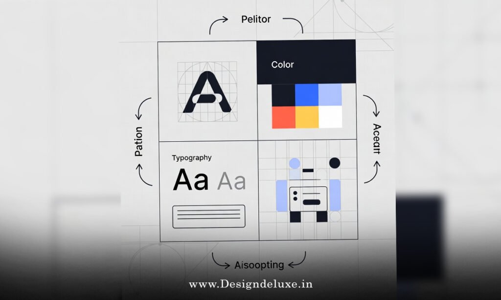
Step 2: Build a Modular Toolkit – The Heart of Adaptive Design
Now comes the fun part: creating interchangeable pieces.
Modular design lies at the core of how to design adaptive visual identity systems. Break your visuals into components:
- Logo variations (primary, simplified, icon-only, stacked)
- Color systems (primary palette + adaptive extensions like gradients or contextual tints)
- Typography (variable fonts for weight/slant shifts)
- Patterns, icons, illustrations (generative or rule-based)
- Motion behaviors (if digital)
Create a library in tools like Figma. Use components with variants—swap colors based on “dark mode” or “energetic campaign” modes.
Rules matter here. Define when to use what. For instance: “Use full logo on hero sections; icon-only on favicons.” Document everything in a brand playbook.
Step 3: Establish Clear Parameters and Rules for Adaptation
This is where many systems fail—too much freedom turns into inconsistency.
Set strict guidelines:
- What triggers change? (Platform size, user data, season, time)
- Limits on variation (e.g., colors stay within 80% of primary palette)
- Minimum recognizability thresholds (core shape always present?)
Use decision trees: If mobile → simplify layout; if festive campaign → introduce seasonal accents.
Think of parameters like guardrails on a highway. They let you speed up creativity without crashing.
Step 4: Incorporate Context and Responsiveness
True adaptivity responds to the environment.
Examples:
- Dark/light mode auto-switches
- Location-based tweaks (cultural colors or motifs)
- Time-sensitive variations (day/night themes)
- User-input personalization (quiz results change palette)
For digital, use CSS variables or design tokens. For print, create seasonal variants.
Test rigorously. Does it still feel like the same brand on a tiny avatar as on a truck wrap?
Step 5: Draw Inspiration from Real-World Masters
Learning by example accelerates everything.
Google’s Doodles keep the wordmark structure while illustrating daily events—pure adaptive genius.
MTV’s logo morphs textures and colors to match youth culture waves.
Airbnb’s Bélo symbol pairs with endless illustrations that adapt to listings or locations.
Spotify flexes gradients and bold typography across playlists and merch.
Nike keeps the Swoosh sacred but layers endless contextual treatments.
Study these. Notice how they protect the core while playing everywhere else.
Step 6: Implementation – From Design to Rollout
Don’t just design—build for maintenance.
- Create a living style guide (digital, searchable)
- Set up component libraries in Figma/Adobe
- Train teams on rules
- Plan for updates (quarterly reviews)
Start small. Pilot on one channel, gather feedback, iterate.
Tools like variable fonts, generative AI for patterns, and prototyping apps help prototype adaptations quickly.
Common Pitfalls to Avoid When Learning How to Design Adaptive Visual Identity Systems
Over-flexibility: Too many variations dilute recognition.
Under-documentation: Without rules, teams improvise badly.
Ignoring accessibility: Adaptivity can’t sacrifice contrast or legibility.
Skipping testing: Assumptions kill brands.
Fix these by prioritizing core > rules > experimentation.
The Future of Adaptive Identities
AI will supercharge this. Generative visuals tailored in real-time? It’s coming.
Brands will become even more organism-like—evolving with data, culture, tech.
Mastering how to design adaptive visual identity systems positions you ahead of the curve.
Conclusion: Take the Leap Toward Adaptive Branding
So, there you have it—a complete roadmap for how to design adaptive visual identity systems. Start with a rock-solid core, build modular tools, set smart rules, respond to context, draw from proven examples, and implement thoughtfully. The result? A brand that’s not just seen but felt—relevant, engaging, and built to last in a chaotic world.
Don’t wait for perfection. Grab your sketchbook (or Figma), define that core, and start experimenting. Your brand will thank you, and so will your audience. Ready to make your identity come alive?
For more on flexible systems, check out Flexible Visual Systems by Martin Lorenz, Pentagram’s work on dynamic identities, and AIGA’s insights on evolving branding.
FAQs
What is the first step in how to design adaptive visual identity systems?
The absolute first step is defining your brand’s unshakable core elements—like key shapes, proportions, or emotional essence—that must remain constant no matter the adaptation.
How do modular components help in how to design adaptive visual identity systems?
Modular components act like building blocks, allowing you to recombine logos, colors, patterns, and typography in endless ways while keeping the overall brand recognizable and cohesive.
Can small businesses afford to learn how to design adaptive visual identity systems?
Absolutely—start simple with a core logo, limited palette variations, and basic rules. Tools like free Figma versions make it accessible without huge budgets.
What role does testing play in how to design adaptive visual identity systems?
Testing ensures adaptations don’t break recognition or accessibility. Mock up variations across devices, contexts, and audiences, then refine based on real feedback.
How often should you update an adaptive visual identity system?
Review quarterly or when major touchpoints change (new platforms, tech shifts). Keep the core eternal, but evolve flexible elements to stay fresh.