Magazine Design
Exaggerated playful typography magazine cover designs grab attention like nothing else in the crowded world of print and digital media. Picture this: massive, bubbly letters stretching across the page, squished serifs that look like they’re having too much fun, or fonts so wildly distorted they feel like they’re jumping off the shelf. These aren’t your average headlines—they’re statements. In an era where scrolling thumbs rule and attention spans shrink, an exaggerated playful typography magazine cover stands out by breaking every rule of restraint.
Why does this style work so well? It taps into pure joy. Think of it as the design equivalent of a cartoon character bursting into your serious day with confetti and giggles. Designers use exaggeration—oversized proportions, unexpected curves, vibrant colors, and whimsical distortions—to create covers that feel alive, approachable, and downright fun. Whether it’s for indie zines, lifestyle mags, or tech publications, this approach turns a static page into an invitation to explore.
What Exactly Makes an Exaggerated Playful Typography Magazine Cover?
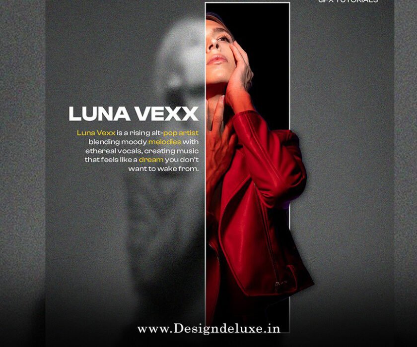
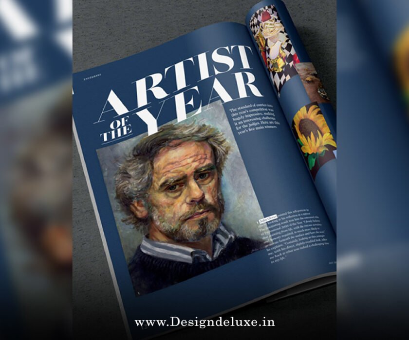
At its core, an exaggerated playful typography magazine cover relies on pushing type beyond normal limits. Regular fonts follow grids and readability rules. These? They ignore them gleefully.
- Scale Gone Wild: Letters balloon to fill half the cover or shrink to tiny whispers for contrast.
- Distortion and Deformation: Stretch, squash, warp—make an “O” look like a balloon or an “S” twist like a snake.
- Hand-Drawn Vibes: Imperfect strokes, doodle elements, or custom lettering that screams personality over perfection.
- Color Play: Neon pops, gradients, or clashing hues that make the type feel electric.
This style draws from historical rebels like David Carson’s grunge-era Ray Gun covers, where readability took a backseat to expression, but amps up the fun factor for modern audiences.
Have you ever flipped through a newsstand and stopped dead because one cover just screamed “look at me”? That’s the power of exaggeration mixed with playfulness.
The History and Evolution of Exaggerated Playful Typography in Magazine Design
Typography on magazine covers has always been a battlefield for attention. Back in the mid-20th century, covers leaned on elegant serifs and clean layouts—think Vogue’s sophisticated mastheads. But the 1990s changed everything. Designers like Carson threw grids out the window, layering chaotic type for punk energy.
Fast-forward to today, and exaggerated playful typography magazine cover trends borrow from that rebellion while adding whimsy. Digital tools like Procreate, Illustrator’s warp effects, and variable fonts make it easier than ever to experiment. Trends in 2025 show hyper-bubble styles, maximalist fonts, and fusion typefaces where serifs crash into sans with gleeful abandon.
Independent mags lead the charge. Titles embrace bold, oversized lettering to stand out in a sea of minimalist Instagram aesthetics. It’s a reaction to clean design fatigue—people crave personality, and nothing delivers like type that winks back at you.
Why Exaggerated Playful Typography Magazine Cover Designs Captivate Readers
Let’s get real: in a world bombarded by ads, why pick up a magazine with screaming type?
First, emotional connection. Playful exaggeration feels human. It mimics how we express excitement—big gestures, loud laughs. When letters bulge or wiggle, they convey joy without words.
Second, hierarchy magic. Exaggerated scale creates instant visual flow. Huge masthead hooks you, smaller (but still fun) cover lines pull you in. It’s like a carnival barker yelling “Step right up!” then whispering secrets.
Third, memorability. Bland covers fade. An exaggerated playful typography magazine cover lingers because it’s unexpected. Readers remember the cover that made them smile.
Finally, brand personality. For youth-oriented or creative pubs, this style says “we’re fun, approachable, not stuffy.” It builds trust through authenticity—readers sense the designer had a blast creating it.
Key Elements to Create Your Own Exaggerated Playful Typography Magazine Cover
Ready to try? Here’s how pros build these eye-poppers.
Choosing the Right Fonts and Custom Lettering
Start with base type that’s sturdy—geometric sans or slab serifs work great as foundations. Then exaggerate:
- Use tools like Fontself or Glyphs to customize.
- Add swashes, ligatures, or alternate glyphs for whimsy.
- Hand-letter for ultimate playfulness—no two letters identical.
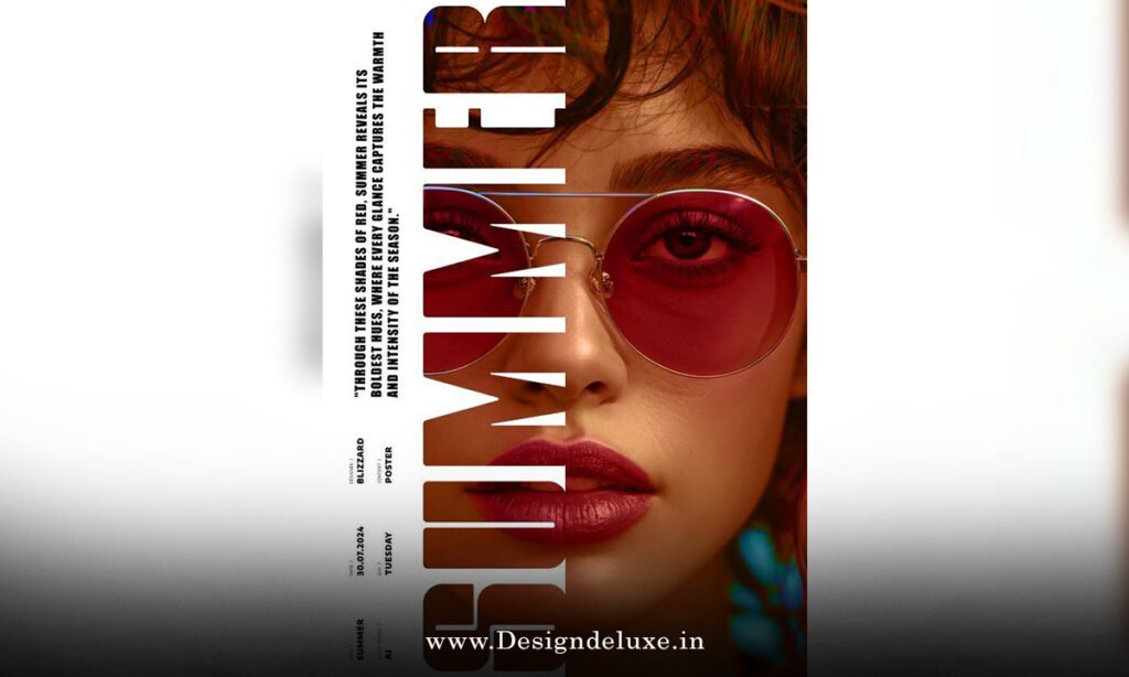
Mastering Scale, Contrast, and Hierarchy
Big isn’t enough—pair massive elements with tiny ones. Think huge title, microscopic teasers. This “exaggerated hierarchy” (as some call it) mirrors classic magazine tricks but dials up the fun.
Incorporating Color, Texture, and Effects
Neon gradients? Gooey shadows? Retro halftones? All fair game. Textures like paper grain or ink splatters make digital type feel tactile.
Balancing with Imagery
Don’t let type overpower photos. Wrap letters around faces, integrate them into illustrations, or let them float playfully.
For inspiration, check out sites like Behance for lettering projects or Shutterstock’s design blog for inventive cover roundups.
Famous Examples and Modern Inspirations of Exaggerated Playful Typography Magazine Covers
Look at CNET’s playful hand-lettered covers—bouncy slogans dancing around models. Or Condé Nast Traveler Spain’s Deco curves wrapping swimmers in joyful motion.
Indie zines push further: warped bubble letters in bright palettes, or anti-design chaos where type overlaps wildly.
Current trends include metallic retro, liquid warps, and hyper-bubble softness—think fonts like Gambado for high-impact exaggeration.
Tips for Beginners: How to Design an Exaggerated Playful Typography Magazine Cover
Don’t fear the mess. Start simple:
- Sketch ideas by hand—loosen up.
- Digitize in Illustrator—use envelope distort for fun warps.
- Test on mockups—see how it pops on a shelf.
- Get feedback—does it make people grin?
Remember, playfulness comes from confidence. Experiment fearlessly.
Common Mistakes to Avoid in Exaggerated Playful Typography Magazine Cover Creation
Overdo it, and chaos wins—no readability left. Balance exaggeration with clarity.
Ignore brand voice—playful doesn’t fit every pub.
Forget accessibility—ensure contrast for legibility.
The Future of Exaggerated Playful Typography Magazine Covers
With AI tools and variable fonts, expect more interactive, animated versions for digital. Print will stay bold, pushing maximalism as minimalism fades.
This style isn’t a trend—it’s a mindset: design should delight.
In wrapping up, an exaggerated playful typography magazine cover transforms ordinary print into joyful art. It hooks with scale, delights with whimsy, and builds connection through personality. Whether you’re a designer crafting your next issue or a reader drawn to bold visuals, embrace the exaggeration. Your next cover could be the one that makes someone stop, smile, and pick it up. Go wild—typography is waiting to play.
FAQs
What is an exaggerated playful typography magazine cover?
An exaggerated playful typography magazine cover features oversized, distorted, or whimsical fonts designed to grab attention with fun and energy, often using bold scales, curves, and colors to stand out.
Why use exaggerated playful typography on magazine covers?
It creates instant visual impact, conveys joy and personality, improves memorability, and helps publications differentiate in competitive markets.
What tools are best for creating an exaggerated playful typography magazine cover?
Adobe Illustrator for distortions, Procreate for hand-lettering, and FontLab for custom fonts—combine with mockup tools to preview.
Can exaggerated playful typography magazine cover designs work for serious topics?
Yes, but balance is key. Use subtle exaggeration for tone control, or pair bold type with thoughtful imagery to match content mood.
How do I make my exaggerated playful typography magazine cover accessible?
Ensure high contrast, avoid excessive distortion on key text, and test readability at various sizes—playful doesn’t mean unreadable.