Magazine Design
Mixed media editorial design for magazines is one of those exciting approaches that’s breathing fresh life into print and digital publications alike. Imagine flipping through a glossy spread where photography collides with hand-drawn sketches, vintage textures meet bold digital overlays, and typography dances across layers of paint-like effects—it’s chaotic yet harmonious, raw yet polished. This isn’t just about slapping elements together; it’s a deliberate artistic strategy that captivates readers in an era where attention spans are shorter than ever. If you’ve ever wondered why some magazine pages feel alive while others fall flat, mixed media editorial design for magazines often holds the answer.
What Exactly Is Mixed Media Editorial Design for Magazines?
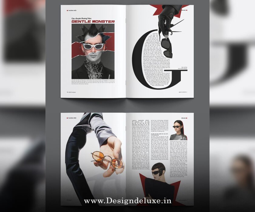
Let’s break it down simply. Mixed media editorial design for magazines refers to the practice of blending multiple artistic mediums and techniques within the layout of magazine pages. Think traditional photography or illustrations combined with digital manipulations, collage elements, hand-painted textures, found objects (digitally scanned), and experimental typography. Unlike straightforward grid-based layouts that rely on clean photos and sans-serif fonts, this style embraces eclecticism.
Why does it matter? In editorial contexts—feature stories, fashion shoots, opinion pieces, or lifestyle sections—mixed media adds depth and personality. It transforms a static page into a visual narrative that mirrors the article’s tone. A travel feature might layer old map fragments over modern photos, evoking nostalgia. A tech article could juxtapose glitchy digital effects with analog sketches to highlight innovation versus tradition.
The beauty lies in its versatility. You can achieve this look entirely digitally using tools like Adobe Photoshop or Procreate, or start with physical collages scanned in for authenticity. Either way, mixed media editorial design for magazines pushes boundaries beyond conventional graphic design.
The Evolution of Mixed Media in Editorial Layouts
Mixed media isn’t new—think back to Dada collages or 1960s underground zines—but its explosion in mainstream magazines came with the digital renaissance. Early adopters in the 2000s experimented with layering in titles like Wired or Dazed, blending gritty photocopies with sleek vectors.
Fast-forward to today, and mixed media editorial design for magazines has become a staple in both indie and major publications. The rise of hybrid print-digital formats has accelerated this. Readers expect tactility even on screens, so designers simulate textures, folds, and imperfections to make pages feel handmade.
Recent trends show a surge in retro-futurism and analog punk aesthetics. We’re seeing chaotic collages with neon accents, distorted typography, and scrapbook-style arrangements. This “more is more” maximalism counters the minimalism fatigue from the 2010s.
Key Elements That Define Mixed Media Editorial Design for Magazines
To nail mixed media editorial design for magazines, focus on these core building blocks:
1. Layering and Depth
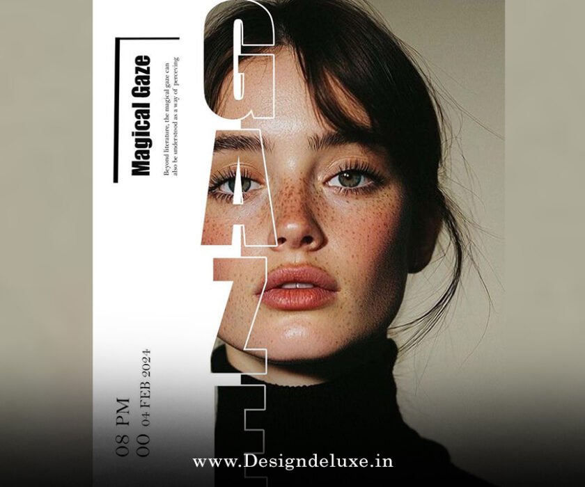
The magic happens in layers. Start with a base image (a hero photograph), add translucent overlays (scanned watercolor washes or grainy textures), then drop in cut-out elements like typography or icons. This creates visual hierarchy—readers’ eyes naturally move from foreground to background.
2. Texture Integration
Textures make or break the tactile illusion. Incorporate paper grains, fabric scans, brush strokes, or even digital noise. In print, actual embossing or spot varnish can elevate this; digitally, subtle parallax scrolling mimics it.
3. Eclectic Typography
Forget rigid fonts. Mix serif with handwritten scripts, bold slabs with delicate scripts. Distort letters, layer them over images, or treat type as collage pieces. This adds personality—think of it as the voice of the page.
4. Color Play and Contrast
Vibrant palettes clash beautifully here. Pair muted vintage tones with electric neons, or use high-contrast duotones. The goal? Emotional impact that supports the story.
5. Asymmetrical Composition
Ditch perfect grids. Embrace imbalance—off-center images, overlapping elements, negative space used dramatically. It feels organic, like a mood board come to life.
Why Choose Mixed Media Editorial Design for Magazines?
You might ask: Why go through the hassle when clean layouts work fine? Here’s the thing—mixed media editorial design for magazines stands out in a crowded media landscape. It boosts engagement by making pages memorable. Readers linger longer, share spreads on social media, and feel a deeper connection.
It also conveys authenticity. In an AI-generated world, the handmade imperfections of mixed media scream “human creativity.” For niche magazines—art, fashion, culture—this style aligns perfectly with brand identity.
Practically, it’s cost-effective too. Many elements come from free stock textures or self-made scans, reducing reliance on expensive photoshoots.

How to Implement Mixed Media Editorial Design for Magazines Step by Step
Ready to try? Here’s a practical guide.
Step 1: Concept and Mood Boarding
Start with the article’s essence. Create a digital or physical mood board pulling references—vintage ads, street art, abstract paintings. Define the mood: playful, moody, rebellious?
Step 2: Gather Your Media
Collect assets: high-res photos, illustrations, textures, scanned ephemera. Digitize physical items for flexibility.
Step 3: Digital Assembly
In Photoshop or InDesign, build layers. Use blending modes (multiply, overlay) for seamless integration. Experiment with opacity and masks.
Step 4: Typography and Hierarchy
Place headlines as collage elements. Ensure readability—contrast is key.
Step 5: Refine and Test
Check flow on different devices. Print proofs if possible—colors shift!
Step 6: Export and Publish
Optimize for print (CMYK, high DPI) or web (RGB, compressed).
Inspiring Examples of Mixed Media Editorial Design for Magazines
Look at indie mags like The Gentlewoman or Apartamento—they often layer intimate photos with textured overlays. Fashion titles experiment with surreal collages in editorials.
For broader inspiration, check out Canva’s magazine layout ideas for practical mixed media tips, or explore Behance portfolios tagged with editorial collage.
Trends in 2025 lean toward hybrid analog-digital: think riso-printed textures combined with 3D renders.
Challenges and How to Overcome Them in Mixed Media Editorial Design for Magazines
It’s not all smooth sailing. Over-layering can make pages cluttered—always prioritize readability. Balance chaos with white space.
Technical hurdles like file management arise with dozens of layers. Organize with groups and name layers clearly.
Brand consistency? Establish guidelines for color palettes and signature elements.
Future of Mixed Media Editorial Design for Magazines
Looking ahead, expect more AR integrations—scan a page to see animated layers. AI tools will assist in generating base textures, but human curation keeps the soul.
Sustainability pushes eco-friendly inks and recycled papers, enhancing the tactile appeal.
Mixed media editorial design for magazines will evolve but stay rooted in creativity and storytelling.
In wrapping up, mixed media editorial design for magazines is more than a trend—it’s a mindset. It invites designers to play, experiment, and infuse emotion into every spread. Whether you’re a seasoned art director or a budding creator, embracing this approach can transform ordinary pages into unforgettable experiences. Grab your tools, layer boldly, and watch your magazine come alive.
Here are three high-authority external links for further reading:
- Canva’s guide to collage and magazine layouts
- Behance for design inspiration and portfolios
- Marq’s magazine design ideas and trends
FAQs About Mixed Media Editorial Design for Magazines
What makes mixed media editorial design for magazines different from traditional layouts?
It combines multiple mediums like collage, textures, and digital effects for a layered, eclectic look, unlike clean, grid-focused traditional designs.
Can beginners try mixed media editorial design for magazines?
Absolutely! Start with free tools like Canva or GIMP, experiment with layering stock images and textures, and build confidence gradually.
Is mixed media editorial design for magazines suitable for all magazine genres?
It shines in creative fields like art, fashion, and lifestyle but can adapt to others with restraint—focus on subtle layers for more formal topics.
How does mixed media editorial design for magazines improve reader engagement?
The visual richness and handmade feel draw eyes longer, encourage shares, and create emotional connections through storytelling.
What tools are best for creating mixed media editorial design for magazines?
Adobe Photoshop and InDesign for pros; Canva or Affinity Designer for accessible starts—pair with texture libraries for authenticity.